
Clicca qui per scaricare una copia stampabile PDF del programma dettagliato del Costume Colloquium IV
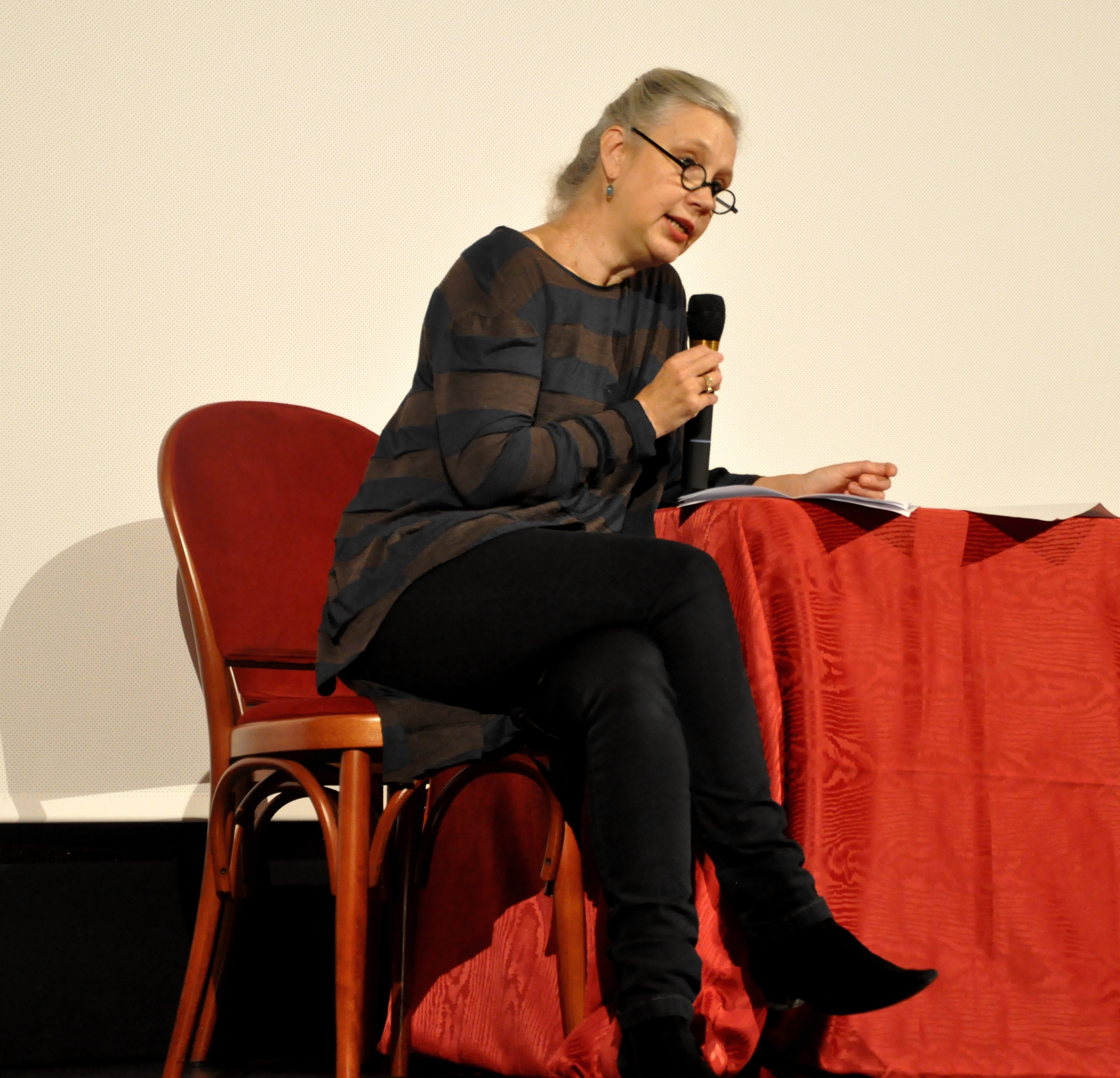
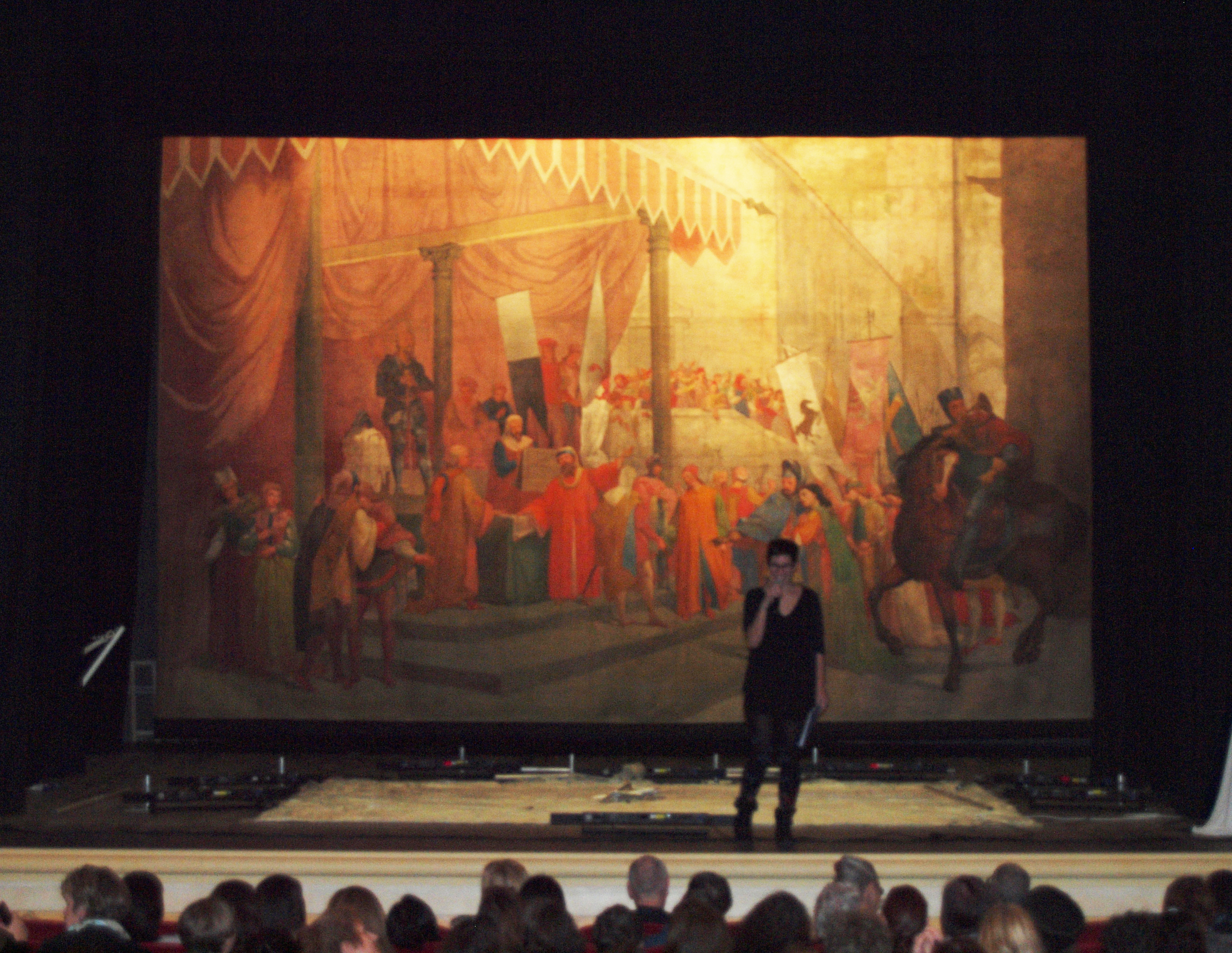
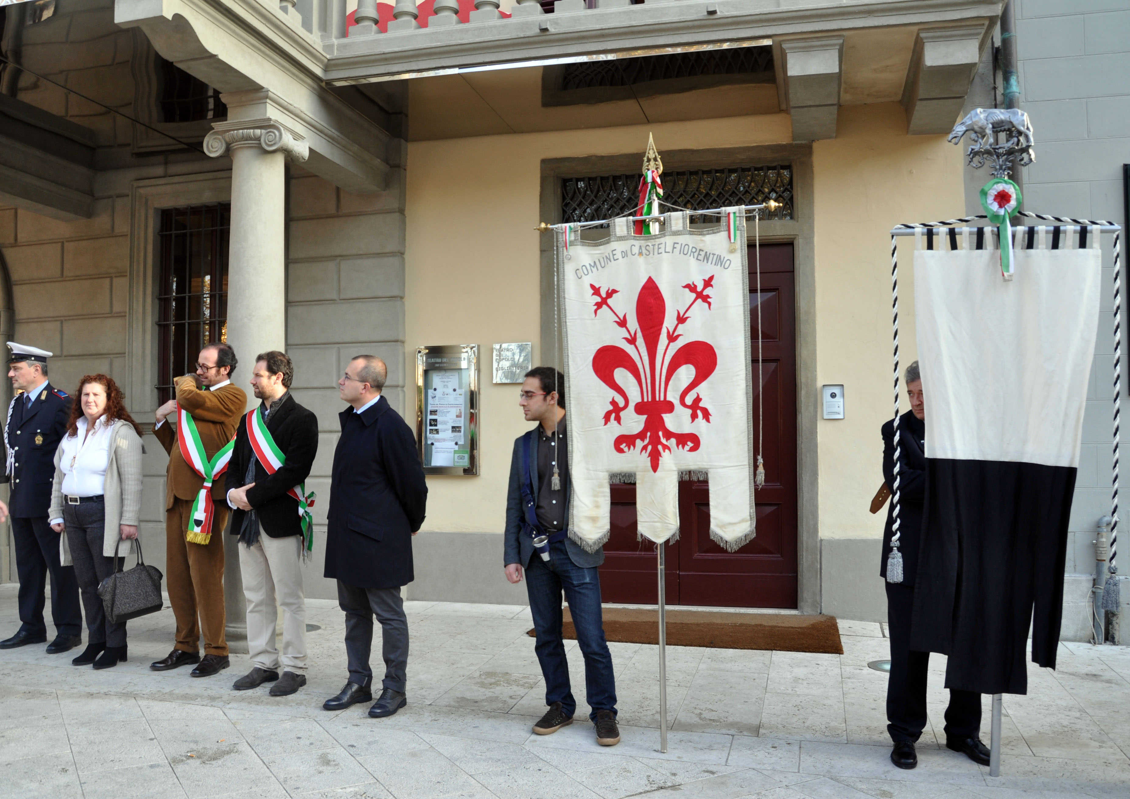
Di seguito, pubblichiamo il discorso di chiusura del Costume Colloquium IV, tenuto presso il Teatro del Popolo di Castelfiorentino da parte di Alexandra Palmer, portavoce del Comitato Scientifico di questa edizione del convegno.
Colours in Fashion –Costume Colloquium IV
Florence, 23 November 2014
Summation by Alexandra Palmer
 Years ago, when walking my young boys home from school one day I remember asking them, What is your favourite colour? Hugo said, Blue. Wyndham said, Rainbow. Children know a thing or two.
Over the past days we have danced under a fashion rainbow of 23 countries and 43 papers. We have explored the physiological, psychological and power of seeing colour. Colour is uniformity and resistance; it creates a collective identity. It can evoke fear – as in a yellow star – or stimulate deep emotion, causing a Japanese man to fall in love with an unseen woman through the harmonious and ravishing colourings of her sleeve that was a symbol of her implied beauty.
Colour in fashion is clearly a case of push or pull that has to be considered in the specific context of time and place. The Quixotic meaning of colour needs to be considered both nationally and transnationally as well as global and local, or we learned, glocale.
We have time traveled and coloured the globe examining dye stuffs that have driven trade with red broadcloth serving as a passport of access, foreign goods of indigo were banned in the 18th century, and a poor rogue navy blue sailor in one century becomes a smart icon of manliness in another.
The power of colour codifies class, professions, race, gender, and age – be it Swedish peasants, Playboy Bunnies, suffragettes, nurses, a method to organize a household in the middle ages or to define group dynamics in modern day Nigeria. It is mutable and shifting. It can be seasonal, but it does not have to be so.
We now understand that black attire can be a blank canvas for a judge, a fascist or an existential avant gardiste. While a black and gold embroidered court suit a plaintiff cry for acknowledgement of social worth, or a complex scientific triumph of a never before seen deep black.
We have literally seen and heard colours and its live performance. We have talked and listened to colour and now know that it is dodgy and its nomenclature fluid. Colour can imply deceit and it can be regulated by law.
We have questioned its descriptions for traders, retailers, consumers, and we have measured and repackaged it numerically, each shade even requiring fractions by the insertion of half tones and half numbers. We have indelibly expanded our rainbow by excavating and now understand lost colours that conjure up names meant to evoke images in readers minds by laying claims to famous people, locations, battles and events as well as the familiar and mundane – mouse and mud – all meant to captivate and entice consumers. Sometimes colour is even so marvelous and elusive it even has to be frenchified in name. One speaker pointed out, that sometimes the information is that which indescribable, the what it is not. It is only what you can imagine.
This is what I call ‘fashionese’; a language of nonsense that somehow works and reassures us. Sometimes it just does not make sense and we need to acknowledge the irrational the complexity and the fun. Our Danish colleagues explained this regarding the Louboutin case, calling it ‘fashion logic.’ But we are also reminded again about the specificity of this fashion logic, because, as now know, in Thailand colours are clearly days of the week.
We have learned that colour is not black and white. It is a messy business, a science experiment, as Joyce Clissold’s marvelous Footprint dye book verifies, along with the deathly arsenical greens, and the deep red of broadcloth all demonstrate. We now question each black and white, and hand coloured image in fashion plates as well as in photographs, films and postcards. We all now have to think more closely about each document: was it painted? Then? When? By whom and why? We will now ask whose colour is it? Who decides and who receives it? Is it faded, is it ‘original’ and is it ‘true’?
Red white and blue is a trail to recover and rethink history, be it in Vichy France or Washington, DC at the White House in 1968. The brilliant multicolours of fin de siècle neon printed textiles, the prewar Ballet Russes and Bakst and the magic promise of fashion in celluloid to 1960s psychedelia or the Hmong transplanted in the USA, all give us new ways to think about the kaleidoscope of colour in time.
The power of colour and technology that opens our eyes also intrigues, disrupts and confuses. Colour is thus an interesting game of brinksmanship tottering between creativity and imitation, distinction and the common place. Thus, there was a rule against multicoloured dress in 18th century Sweden. The triumph of the late 19th century aniline dyes simultaneously caused distrust as Tissot’s young women was too young in her too yellow dress, just as the recent hyper digital prints became too graphic, where no longer new, and so soon no longer desirable. The duplicity of colour has clearly been pointed out, the suspicion and trickery of mistaking a Louboutin for an YSL.
This is a reminder to think forward as well as back in order to understand new technology. Can we accept the latest changes that allow our bodies, our heat or emotions to determine the colour of our clothes? This is technically possible – but do we want it? Who remembers the mood ring?
I was thinking we had not addressed the complexity of colour and camouflage when in the very last paper Michal Lynn Shumate presented the thesis that Viktor&Rolf used Yves Klein blue as camouflage to think about the very creation and presentation of fashion itself.
So I now agree with my son Wyndham. After this four-day experiment of mixing colours, my favourite colour is now rainbow. Together we have expanded our colour spectrum by considering fashion in hue and tone.
This is due to the alchemy of all of you participants, a veritable dye bath of researchers, audience and organizers that – like indigo – transforms when exposed to the Florentine air, food and wine. I think we have covered the rainbow and hopefully each will take away from this conference their own pot of gold…or yellow, ochre, chrome, marigold… or an imitation.
We now all have carte blanche to rethink the when, who, whose, and why of Colours in Fashion.
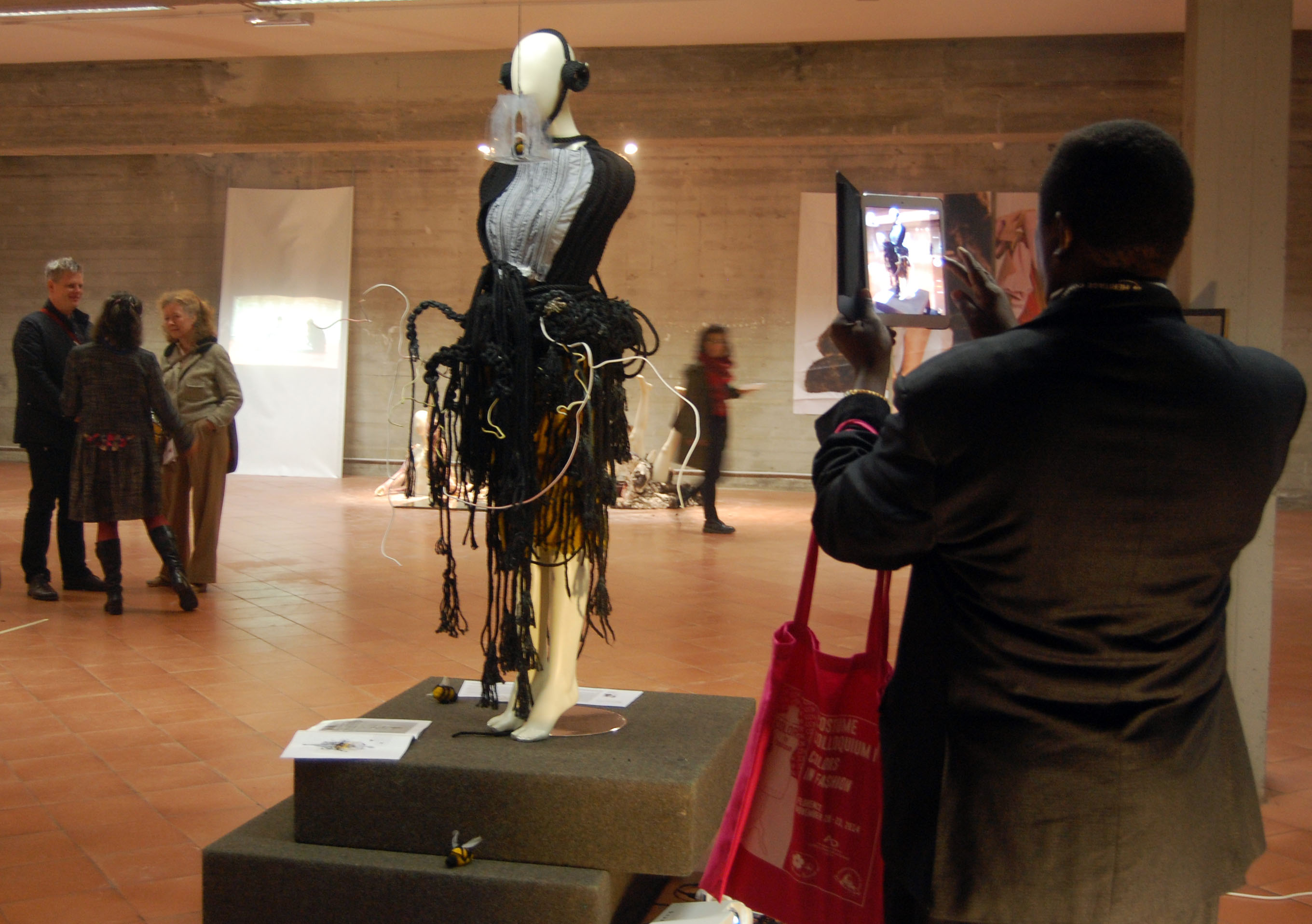
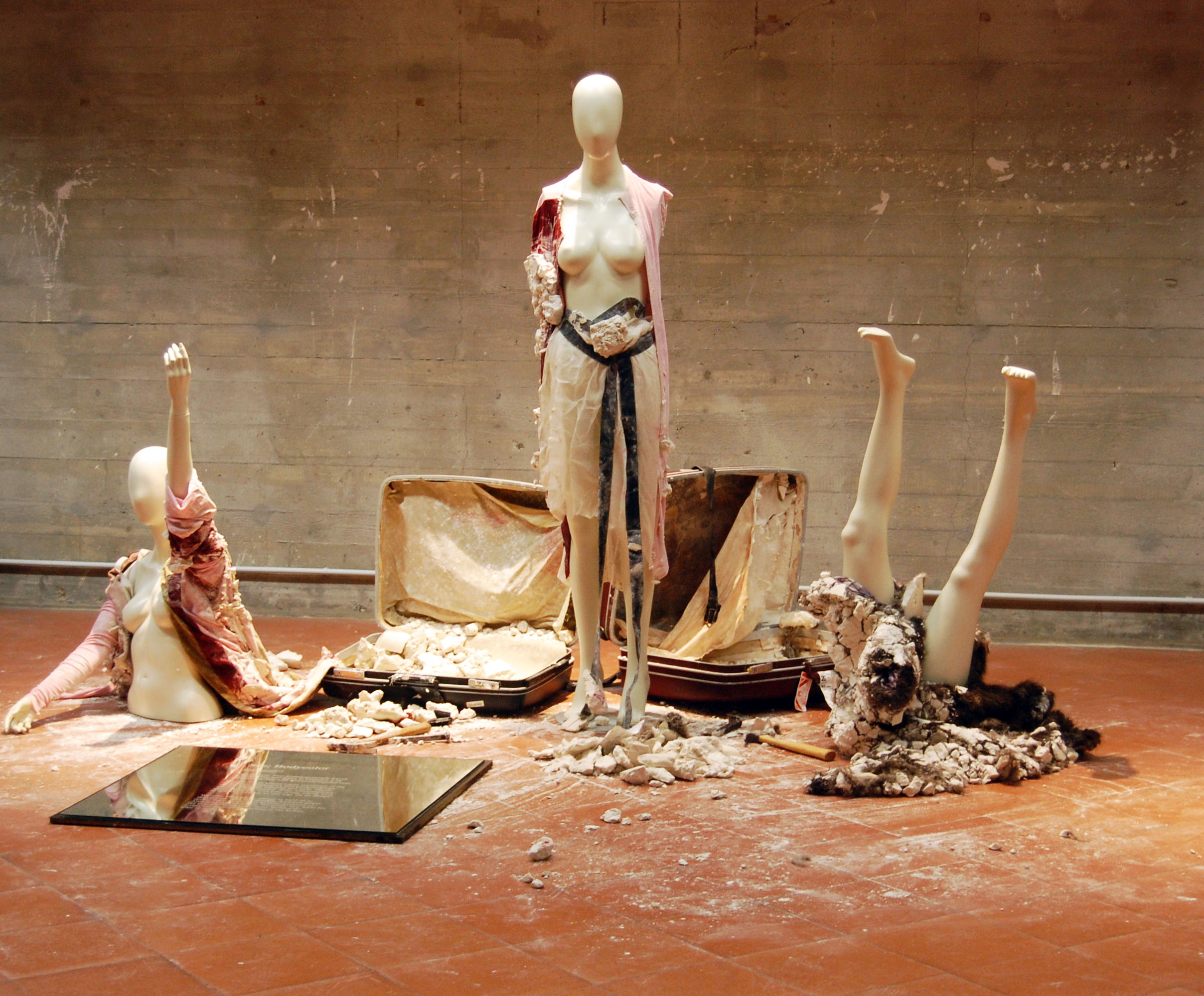
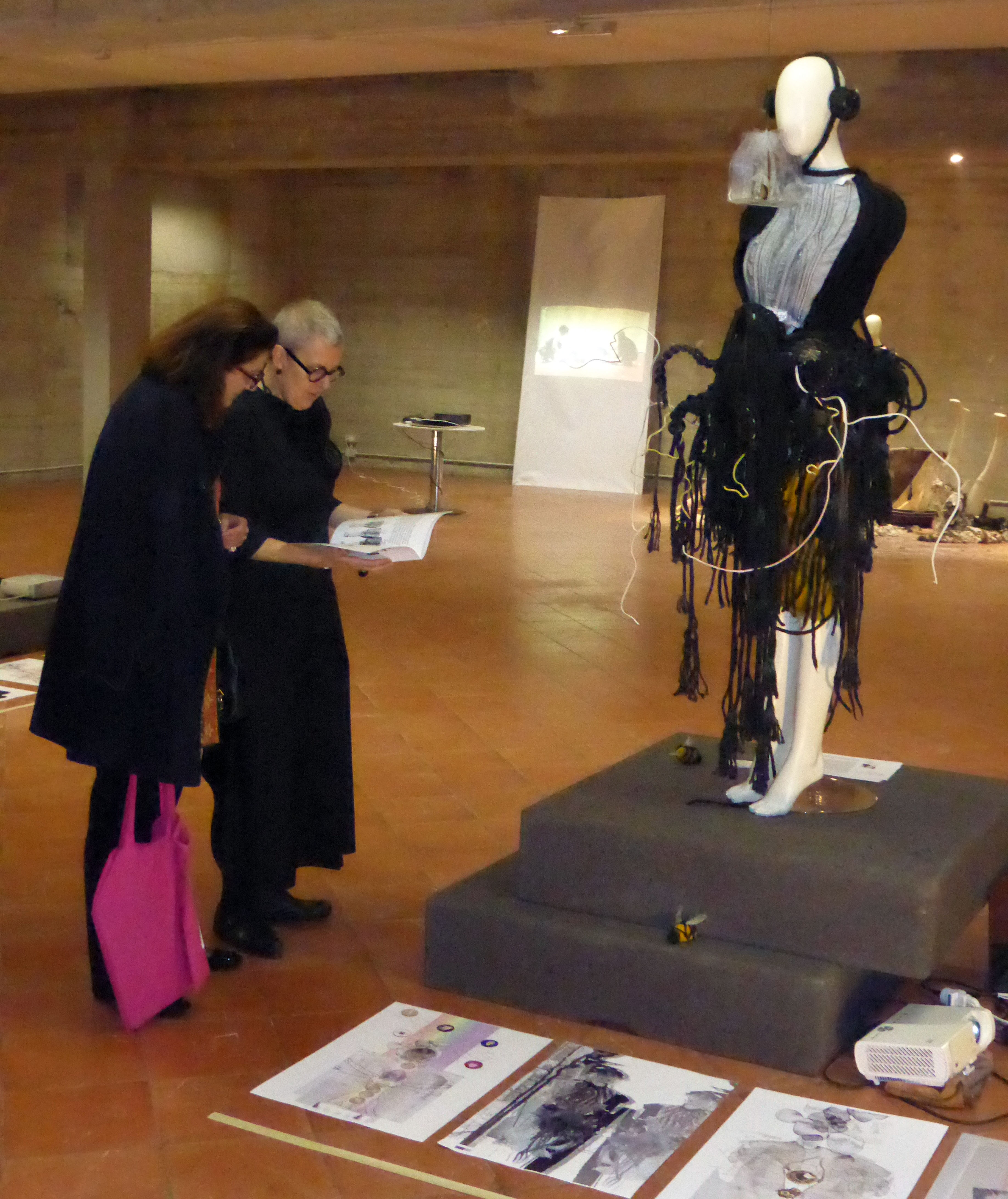
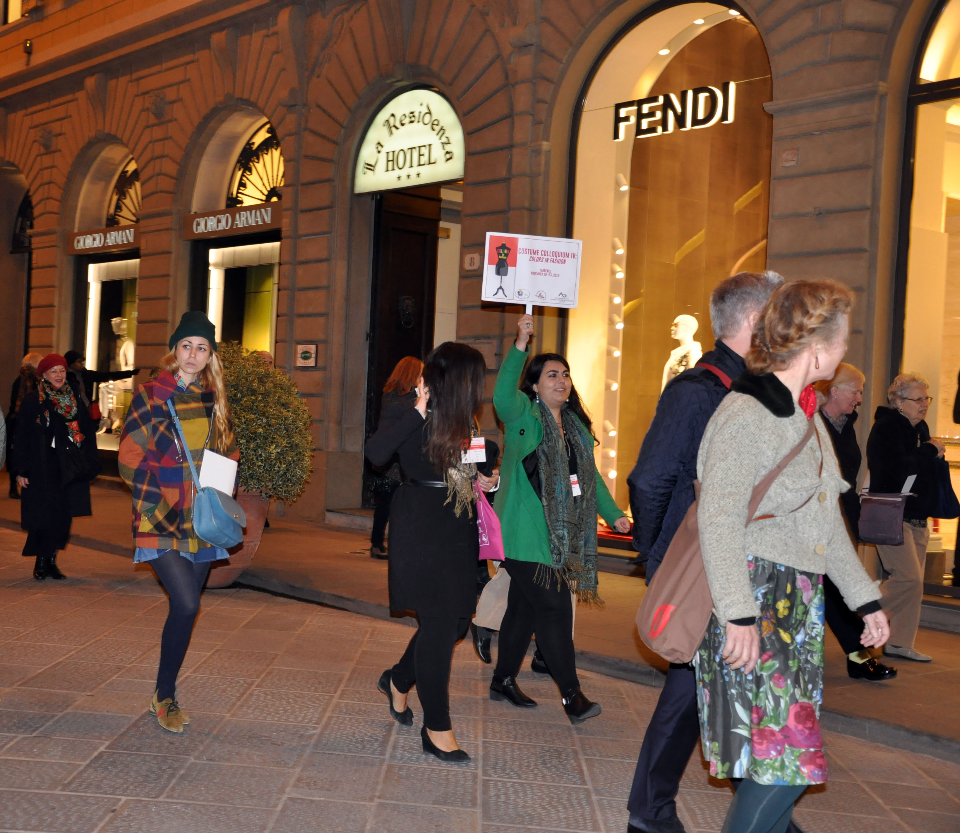
PHOTO GALLERY
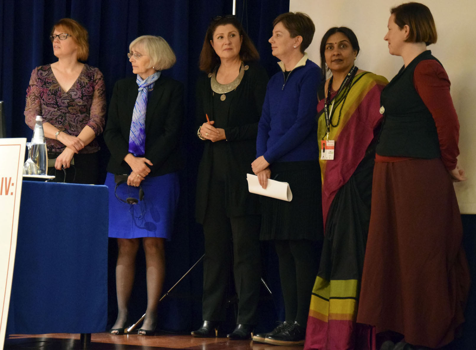
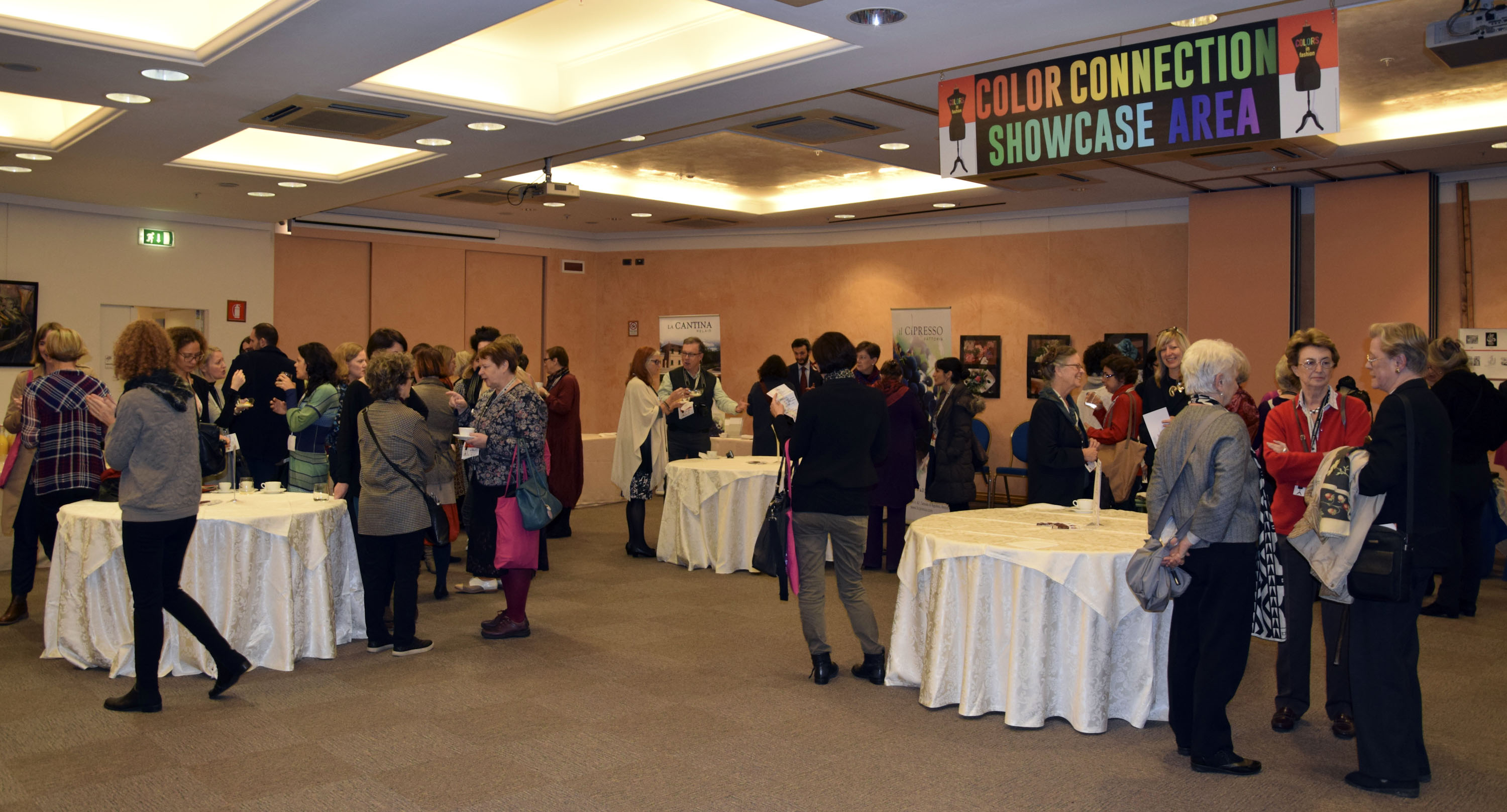
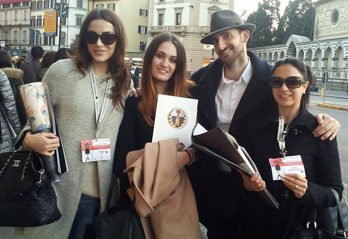
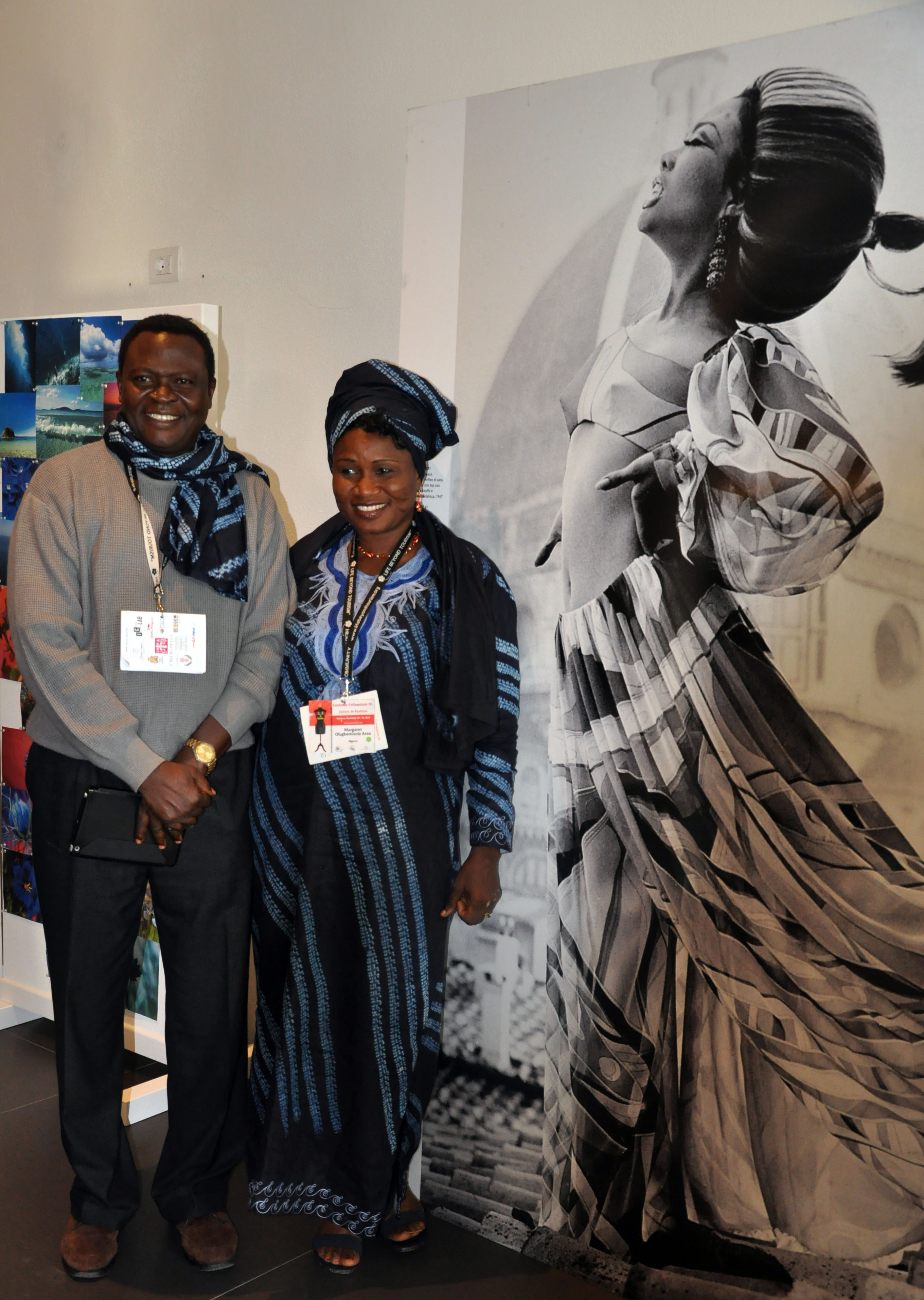
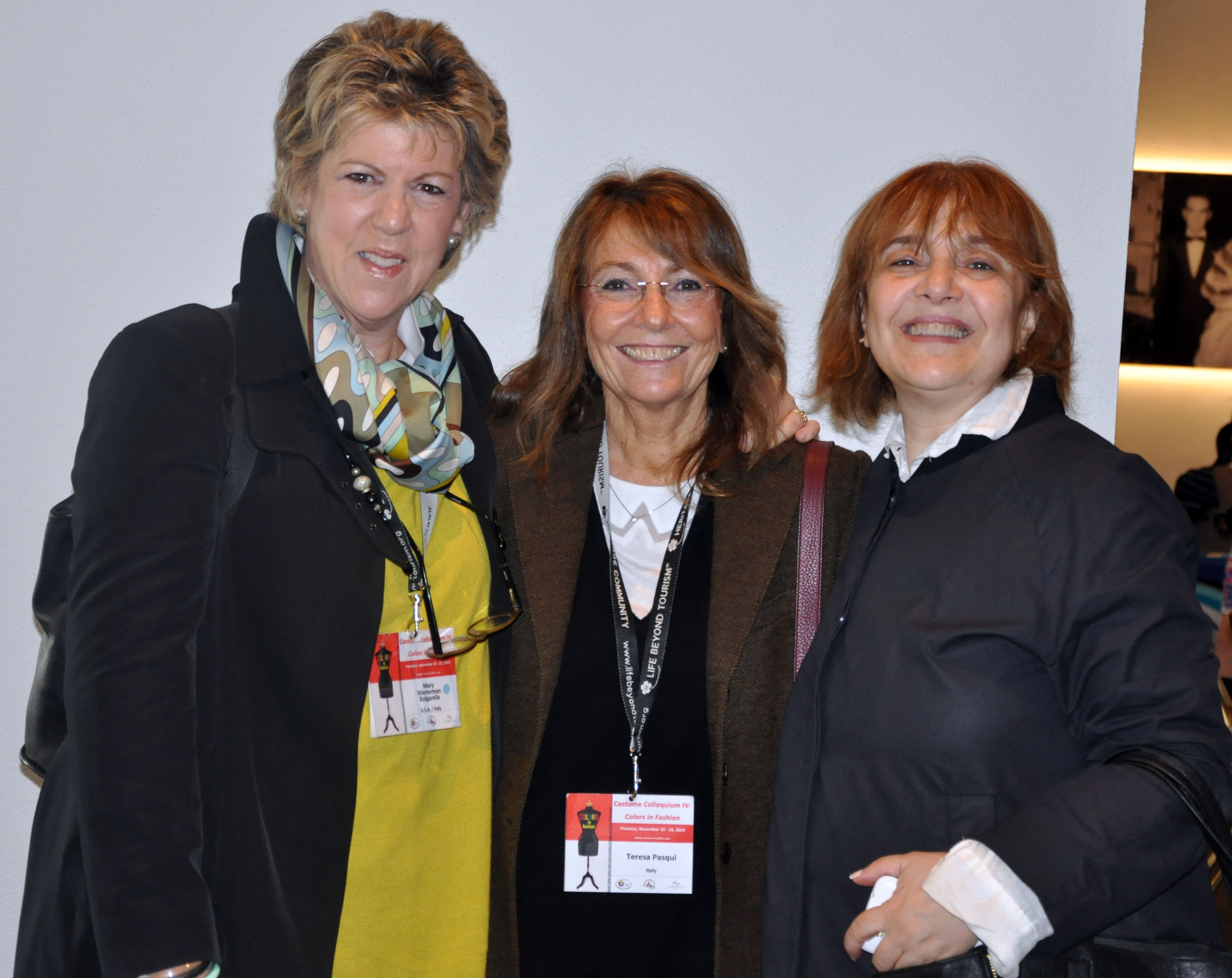
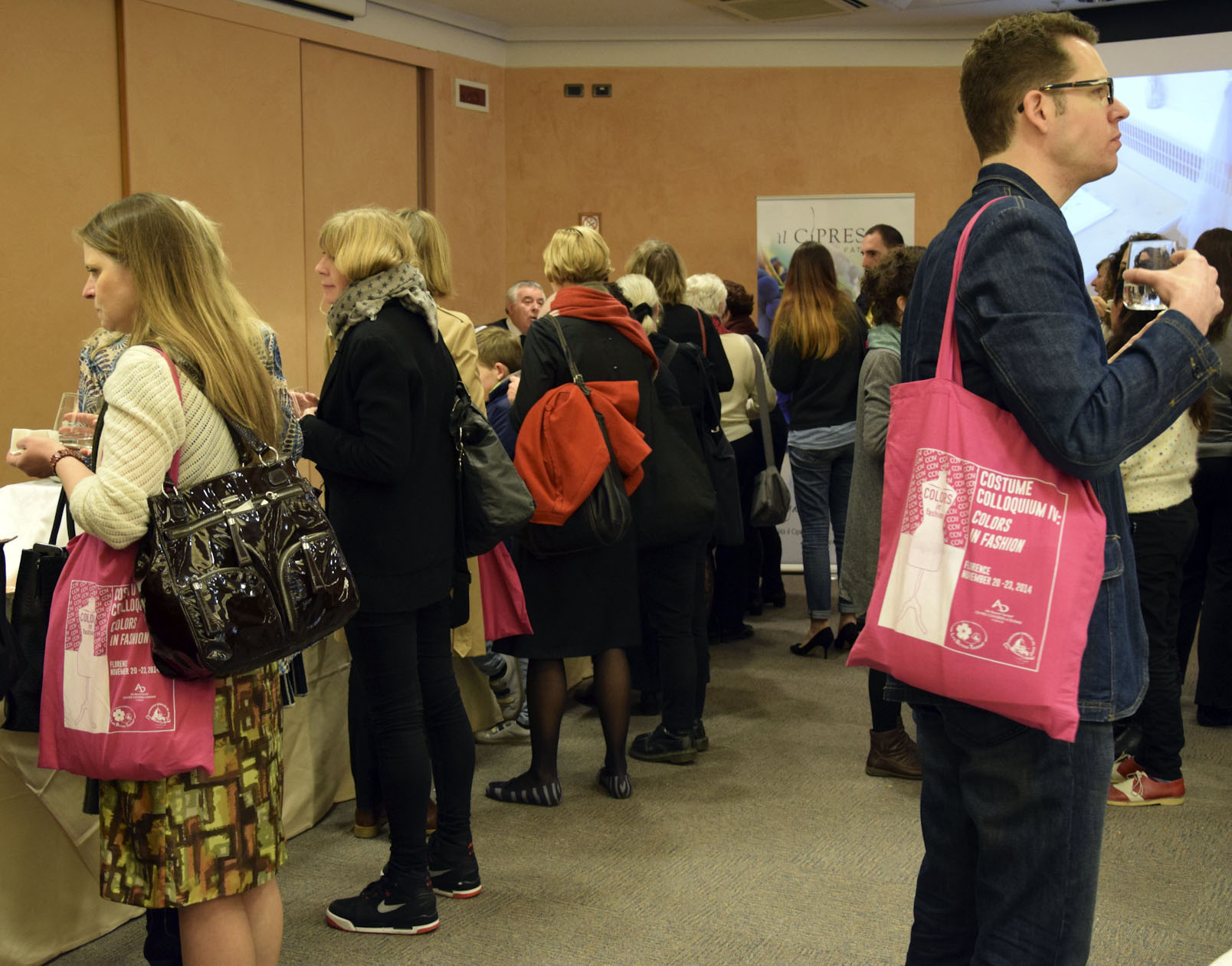
I partecipanti del Costume Colloquium IV – Colors in Fashion:
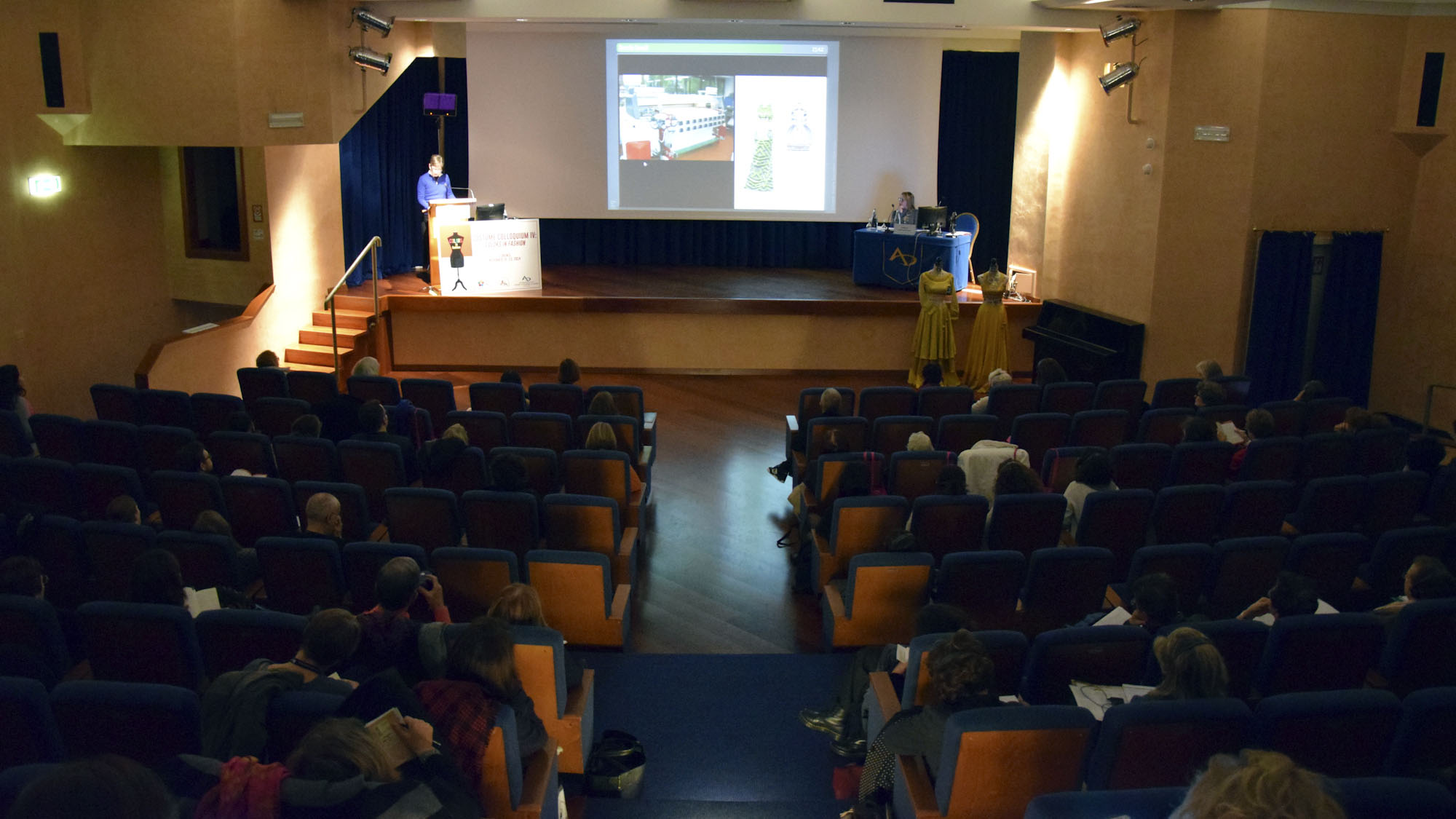
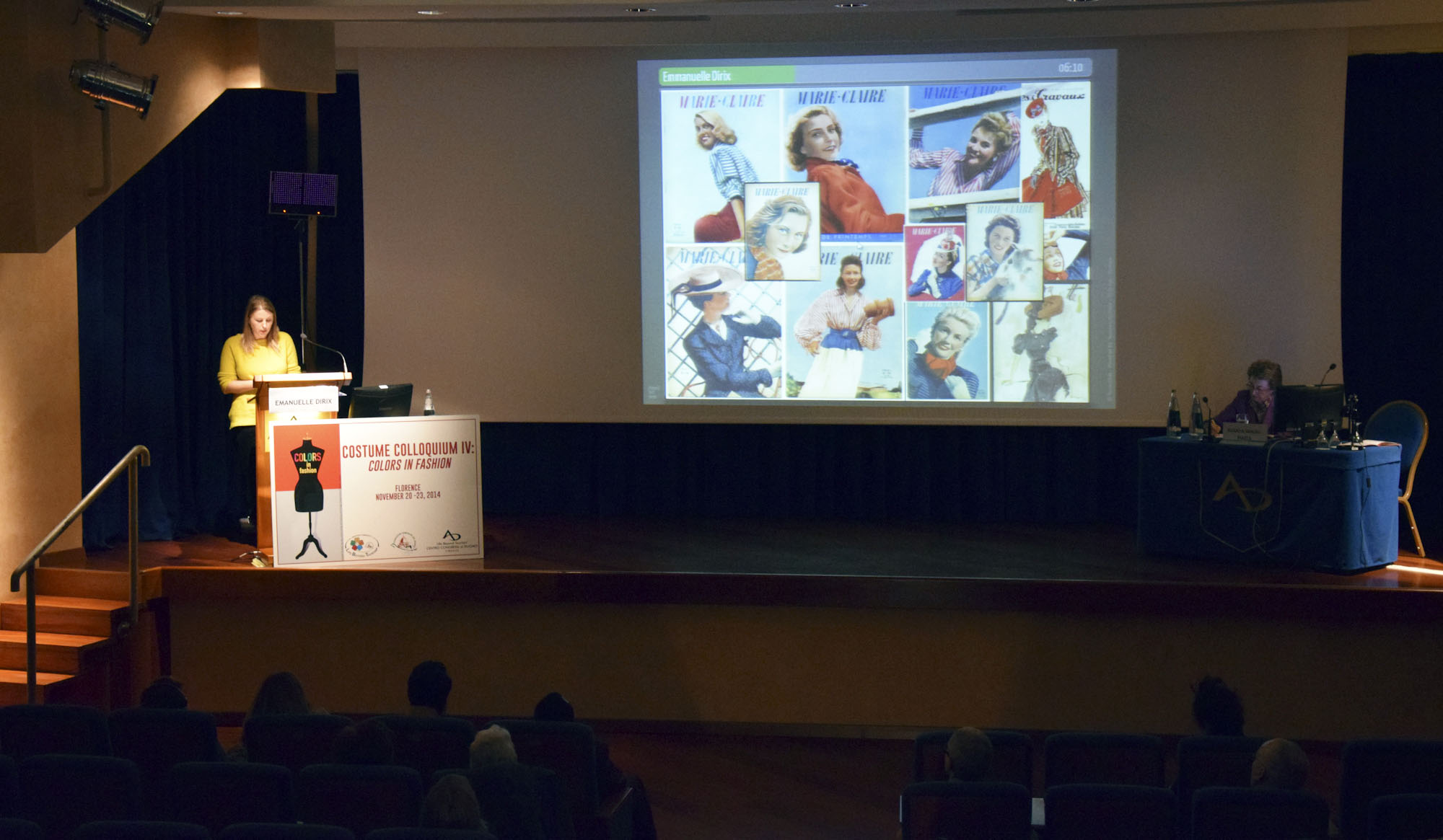
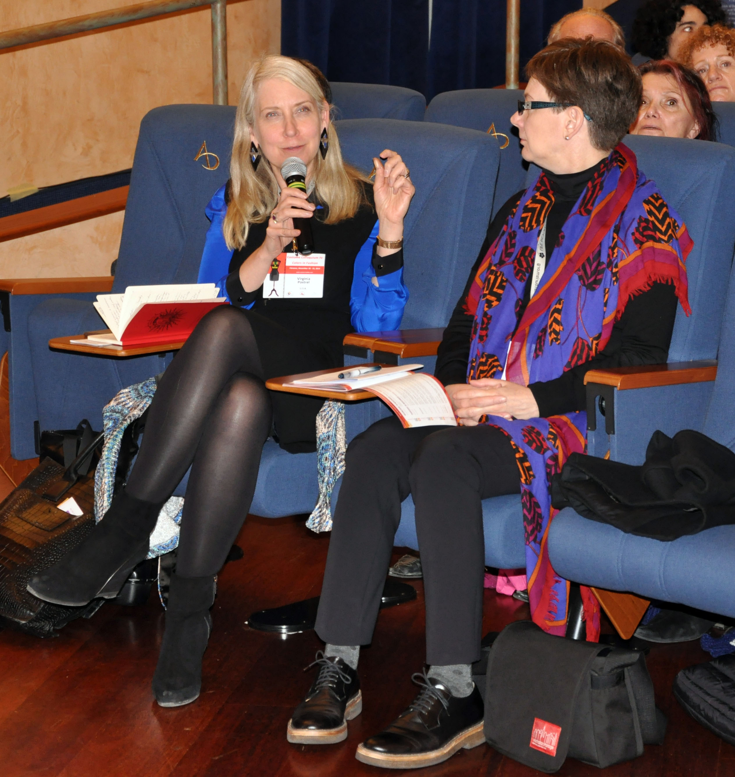
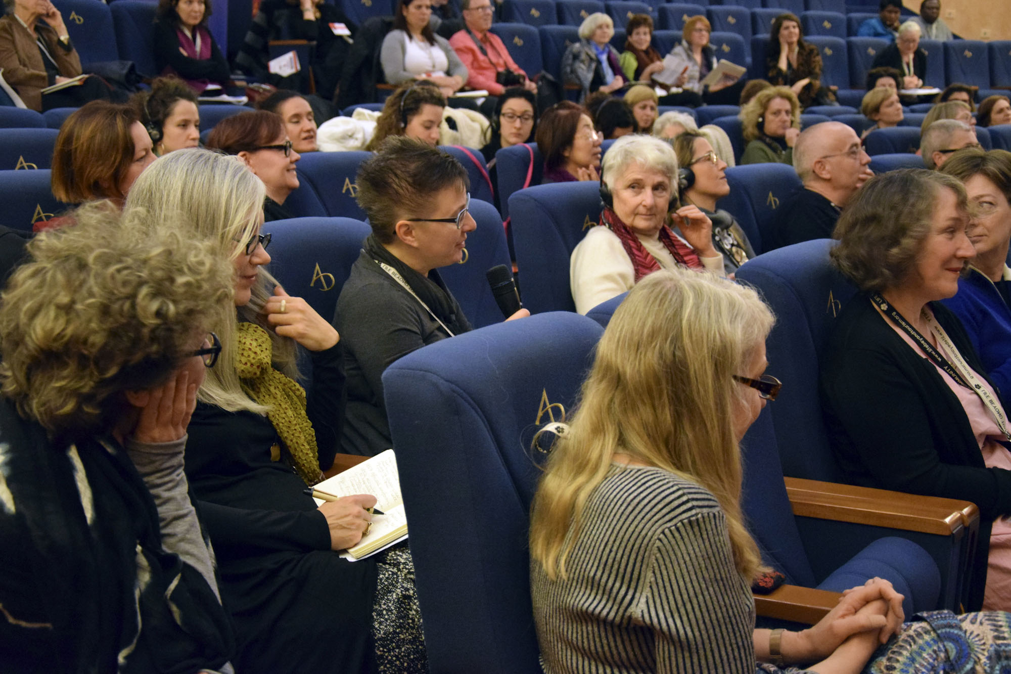
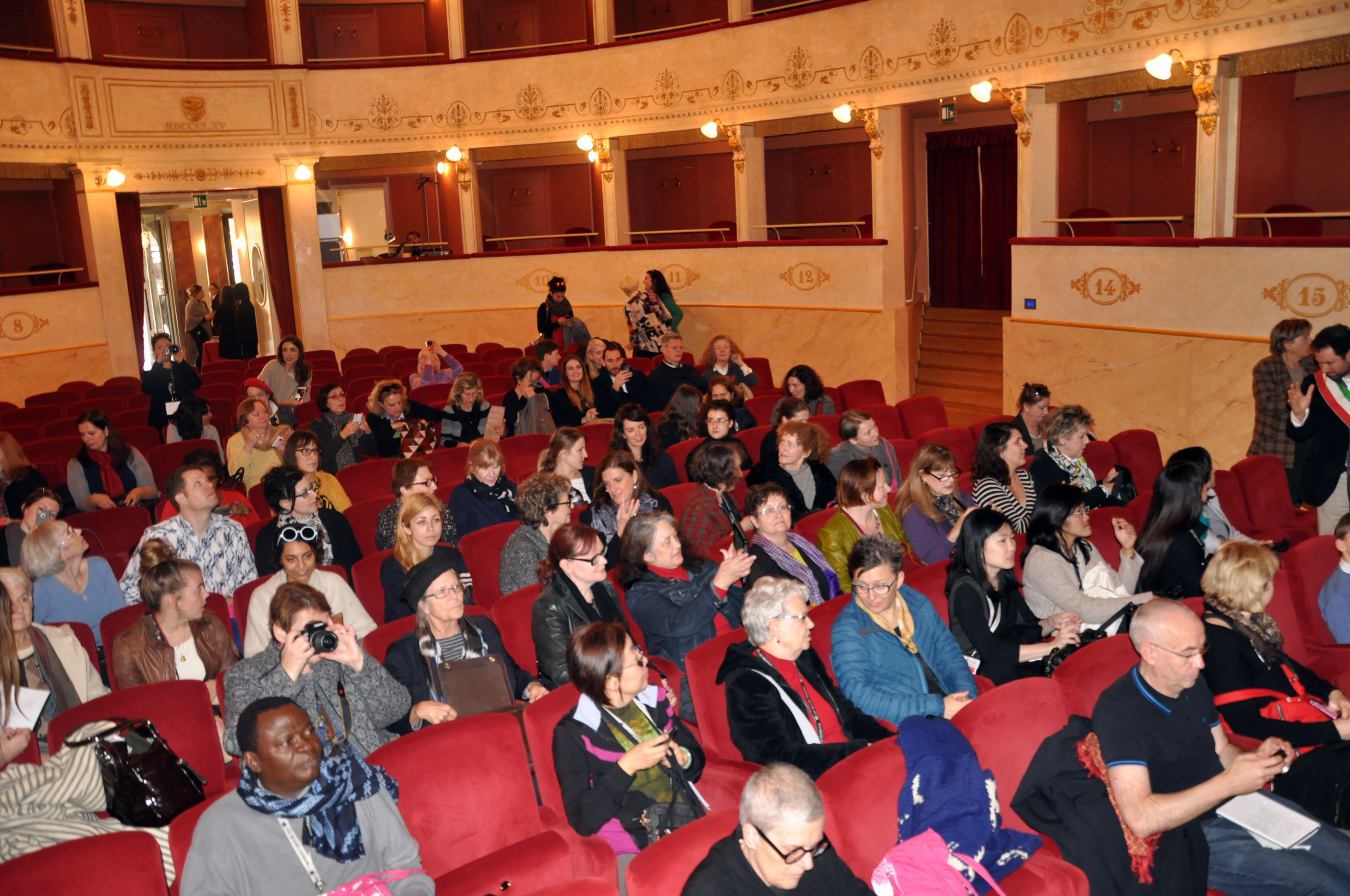
- Alcuni momenti di ascolto delle presentazioni dei papers:
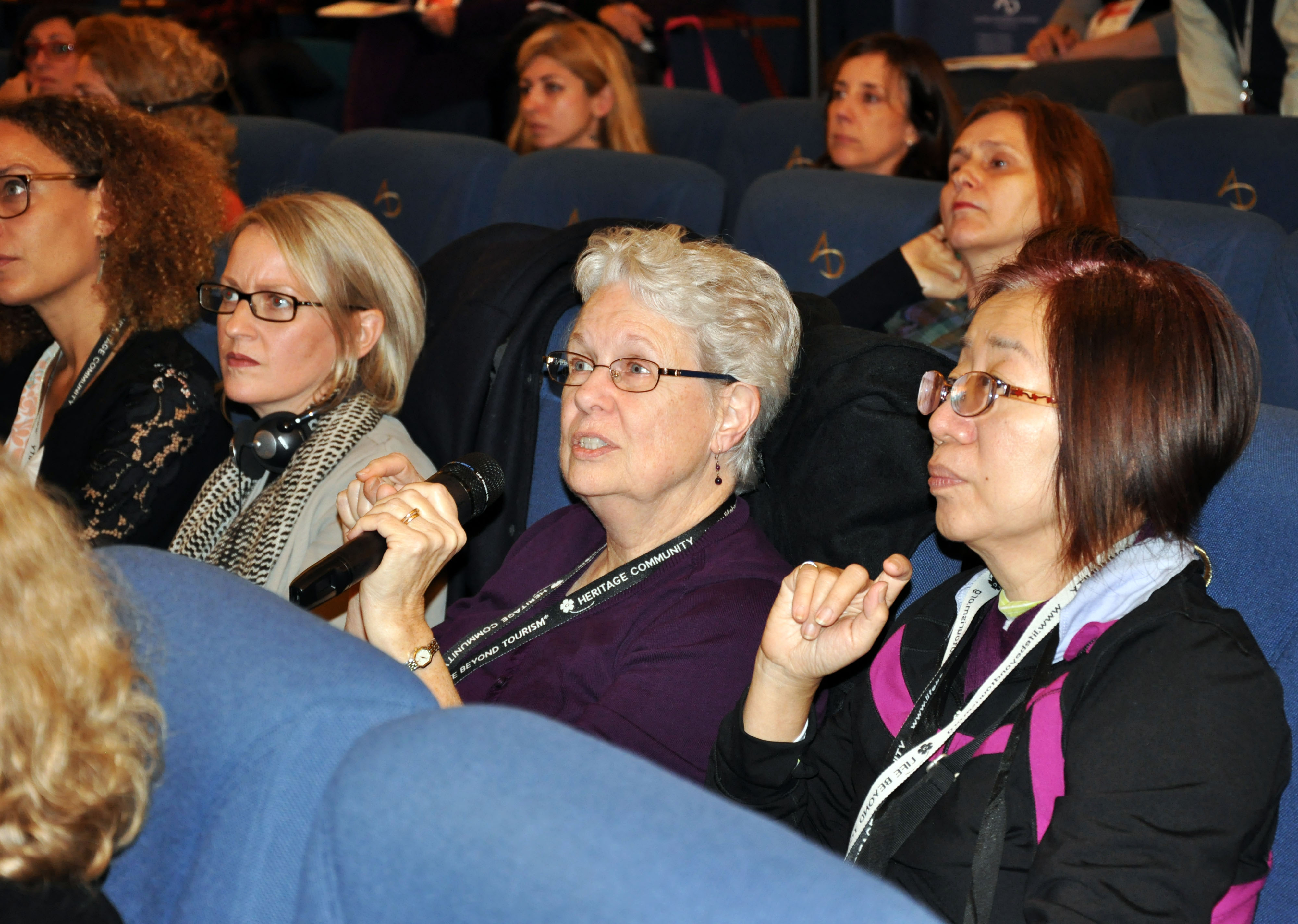
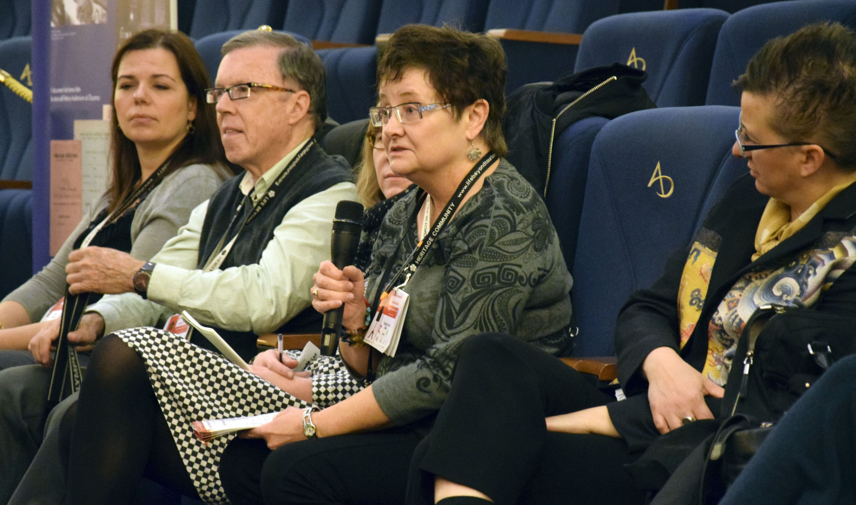
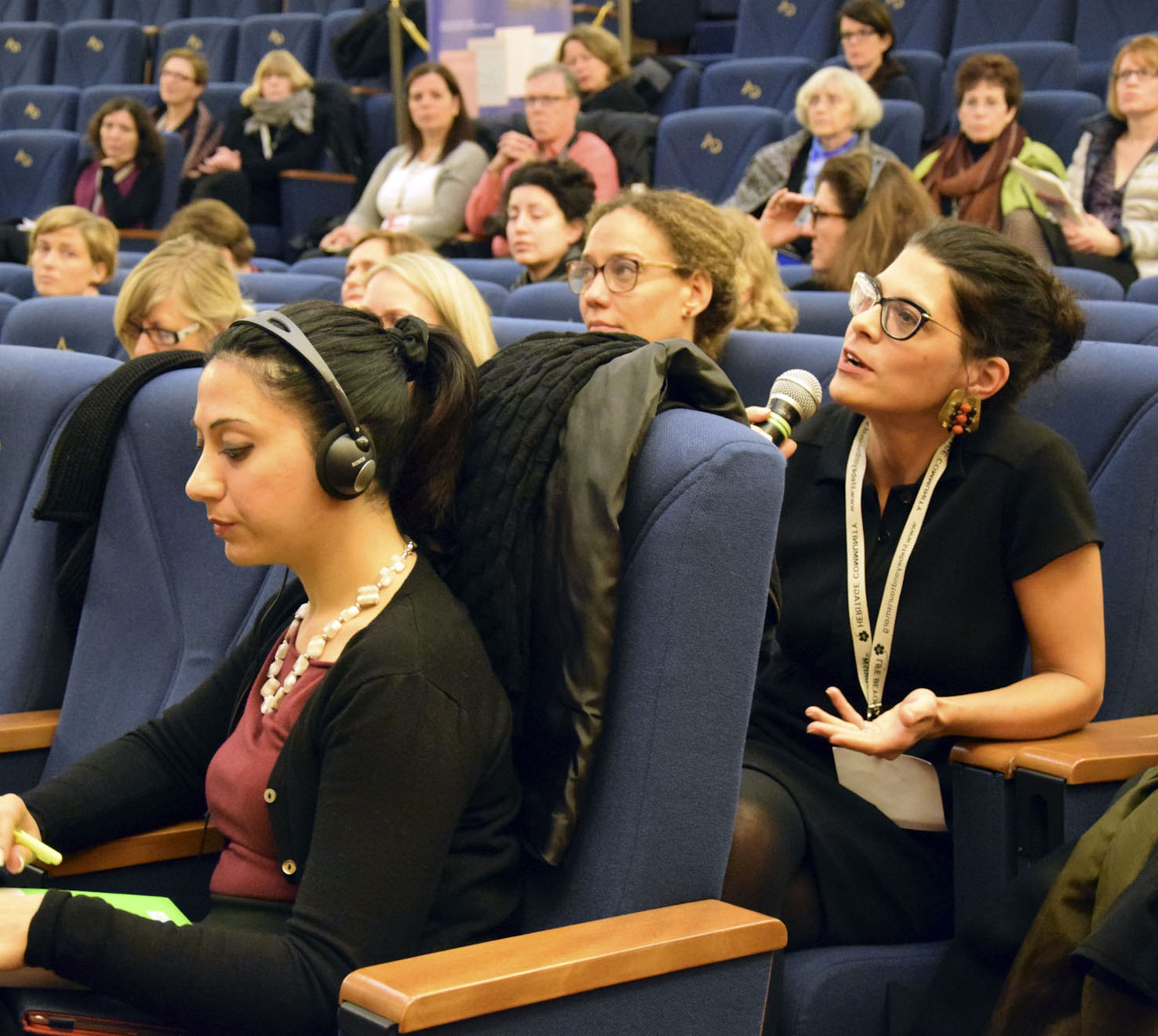
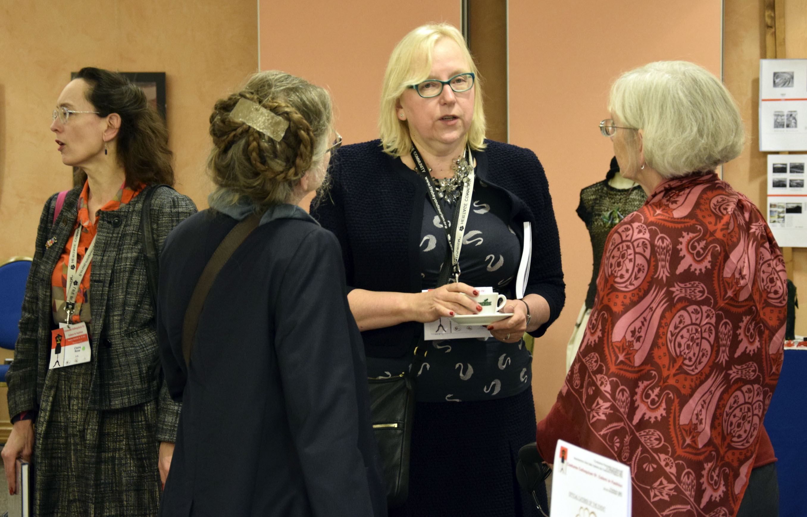
- Momenti di discussione durante i lavori congressuali:


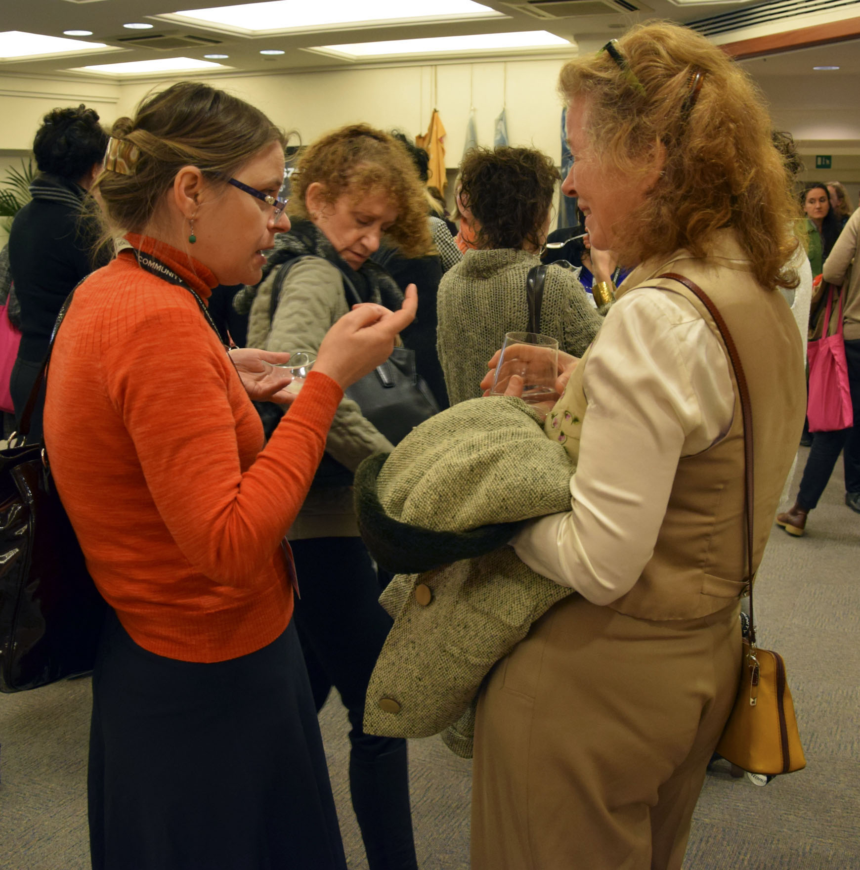
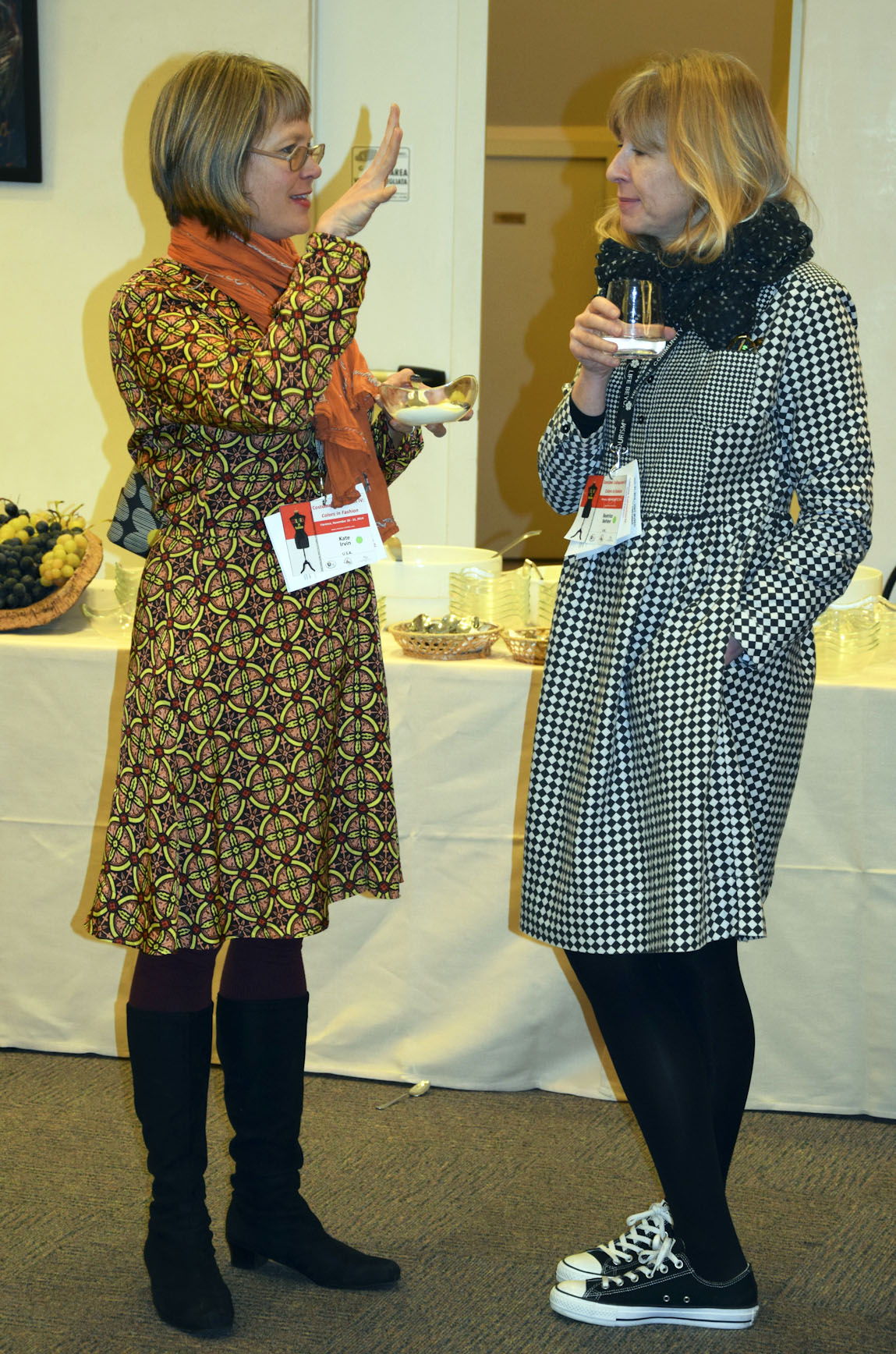
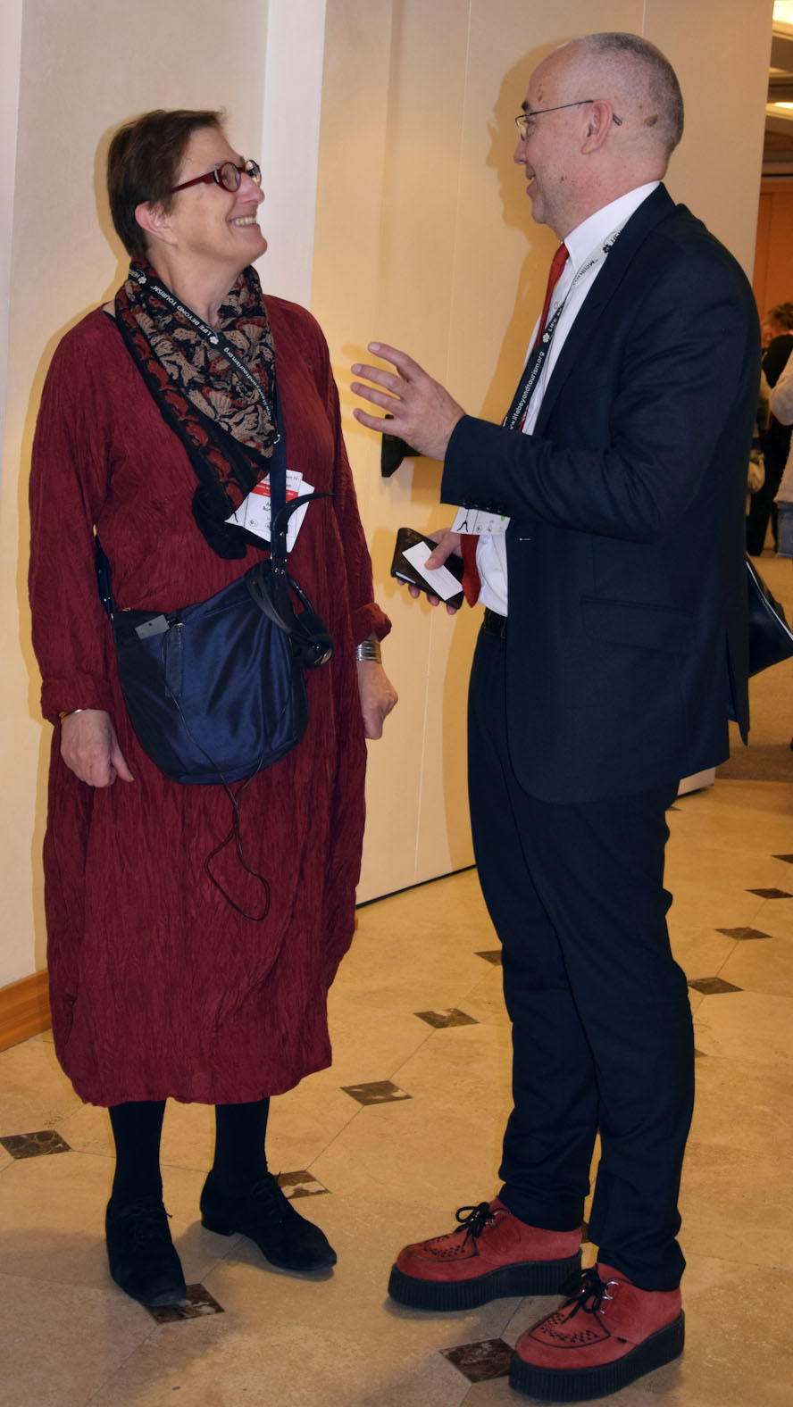
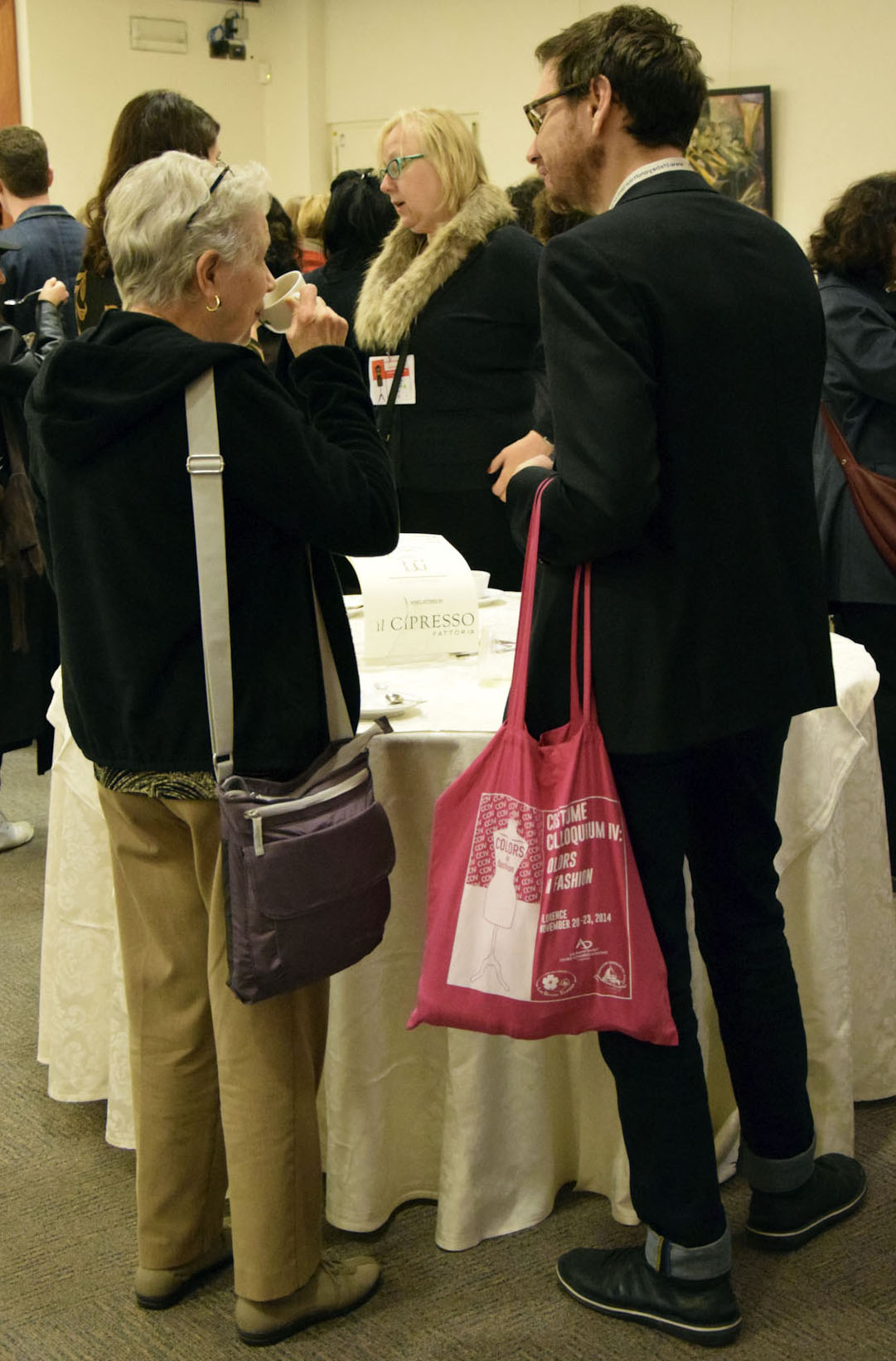
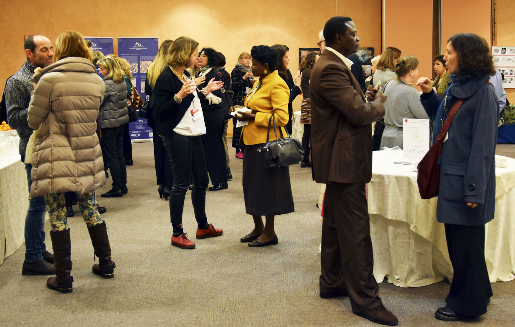
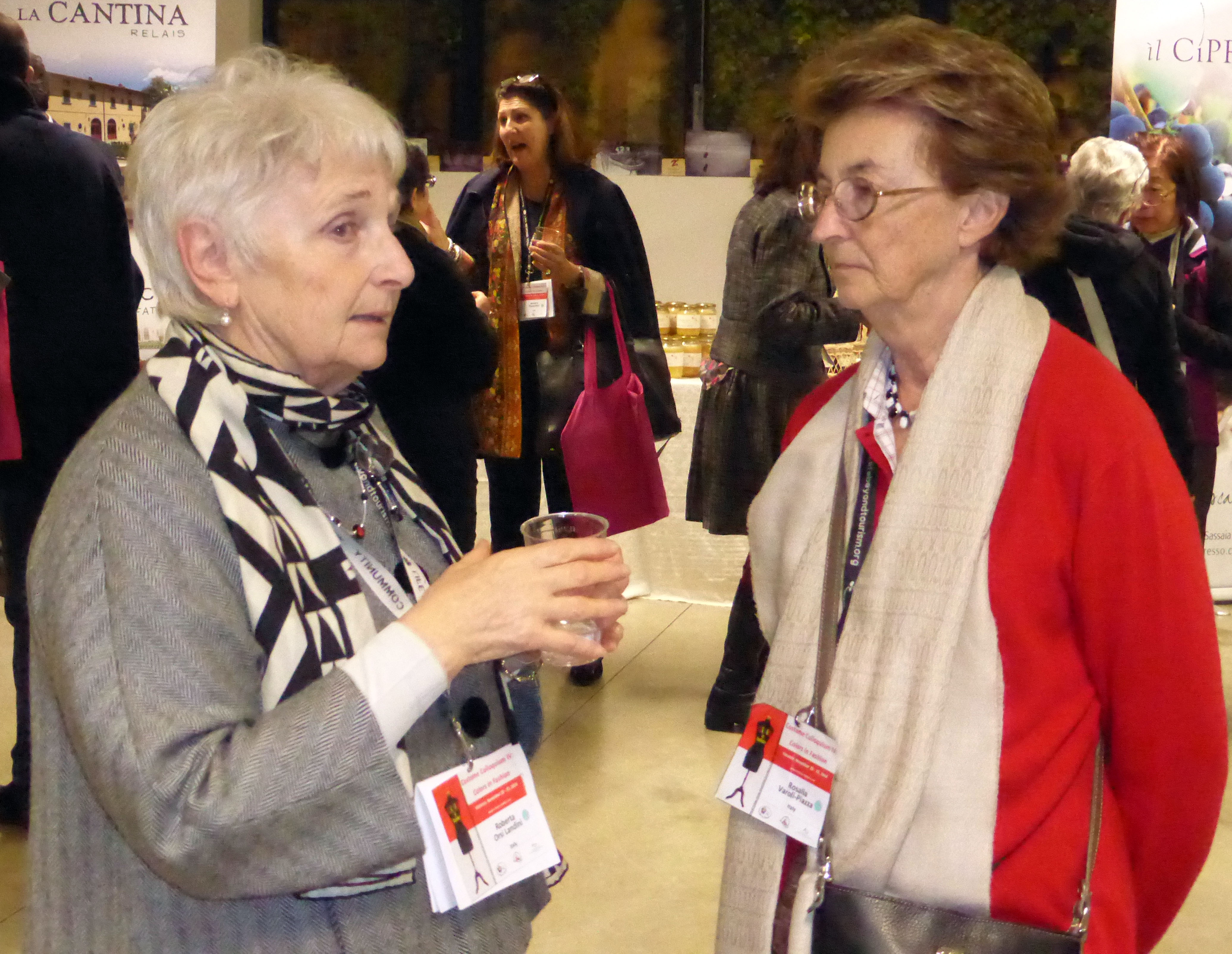
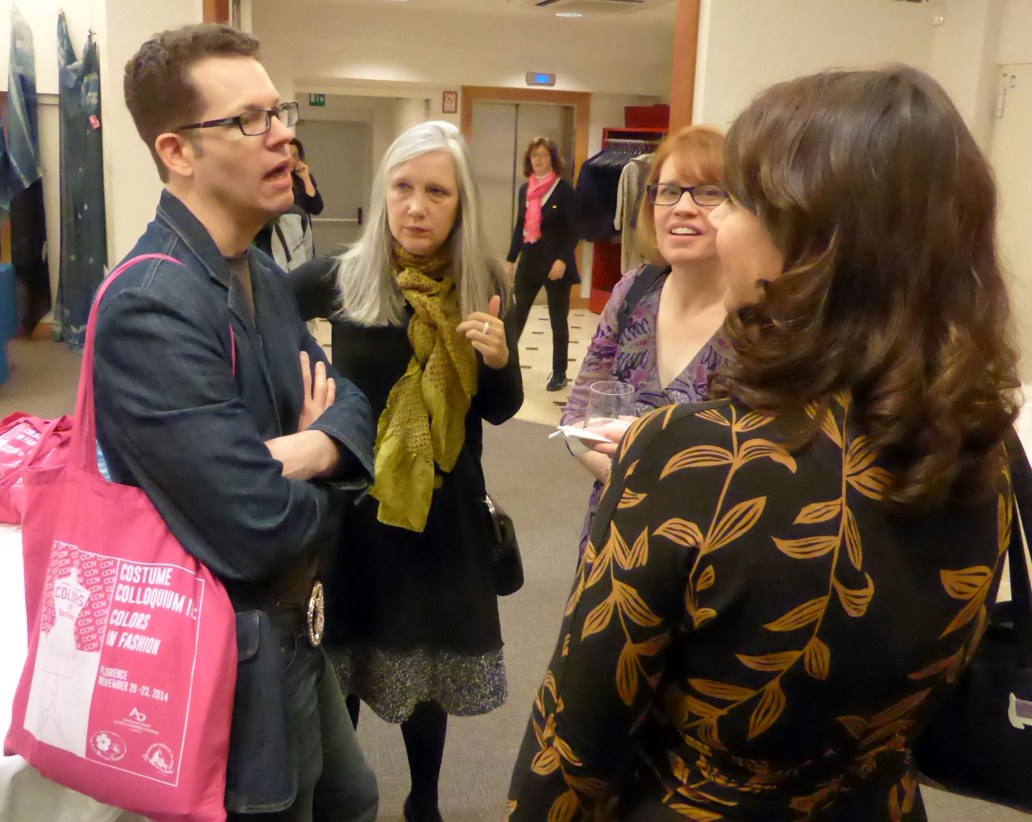
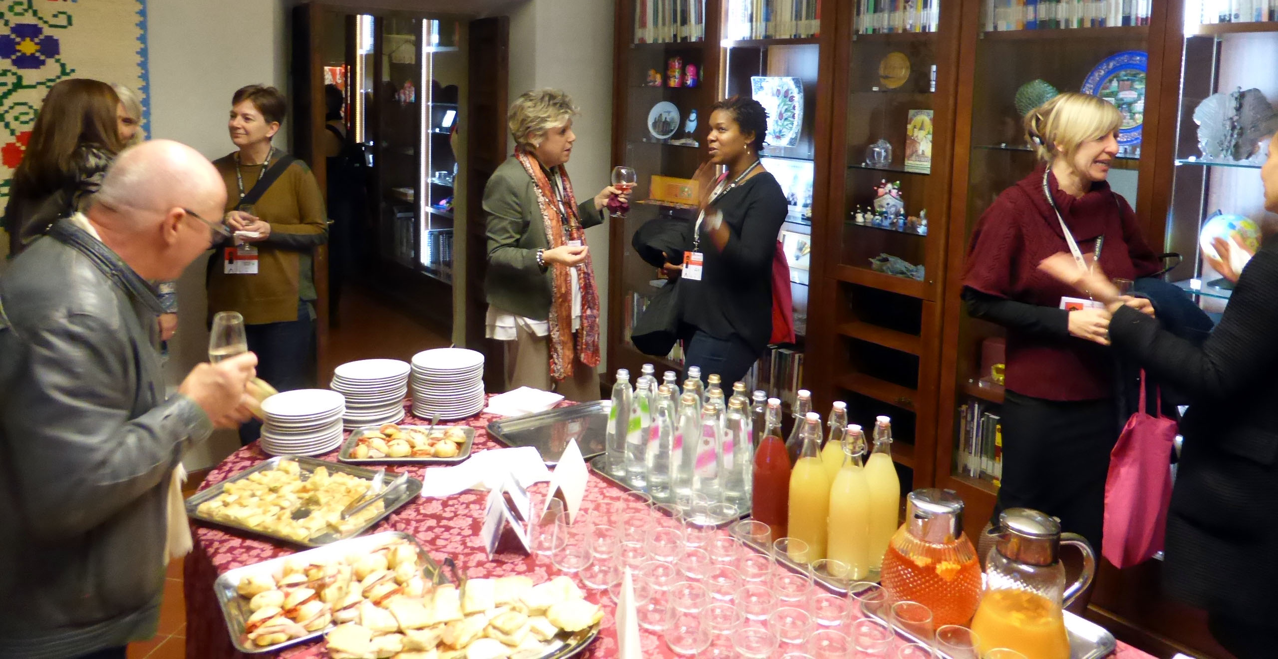
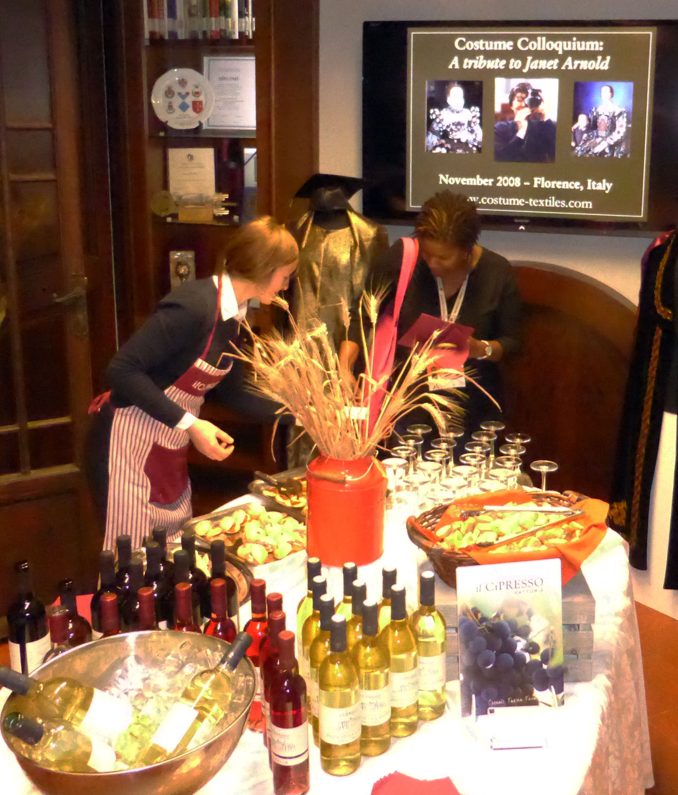
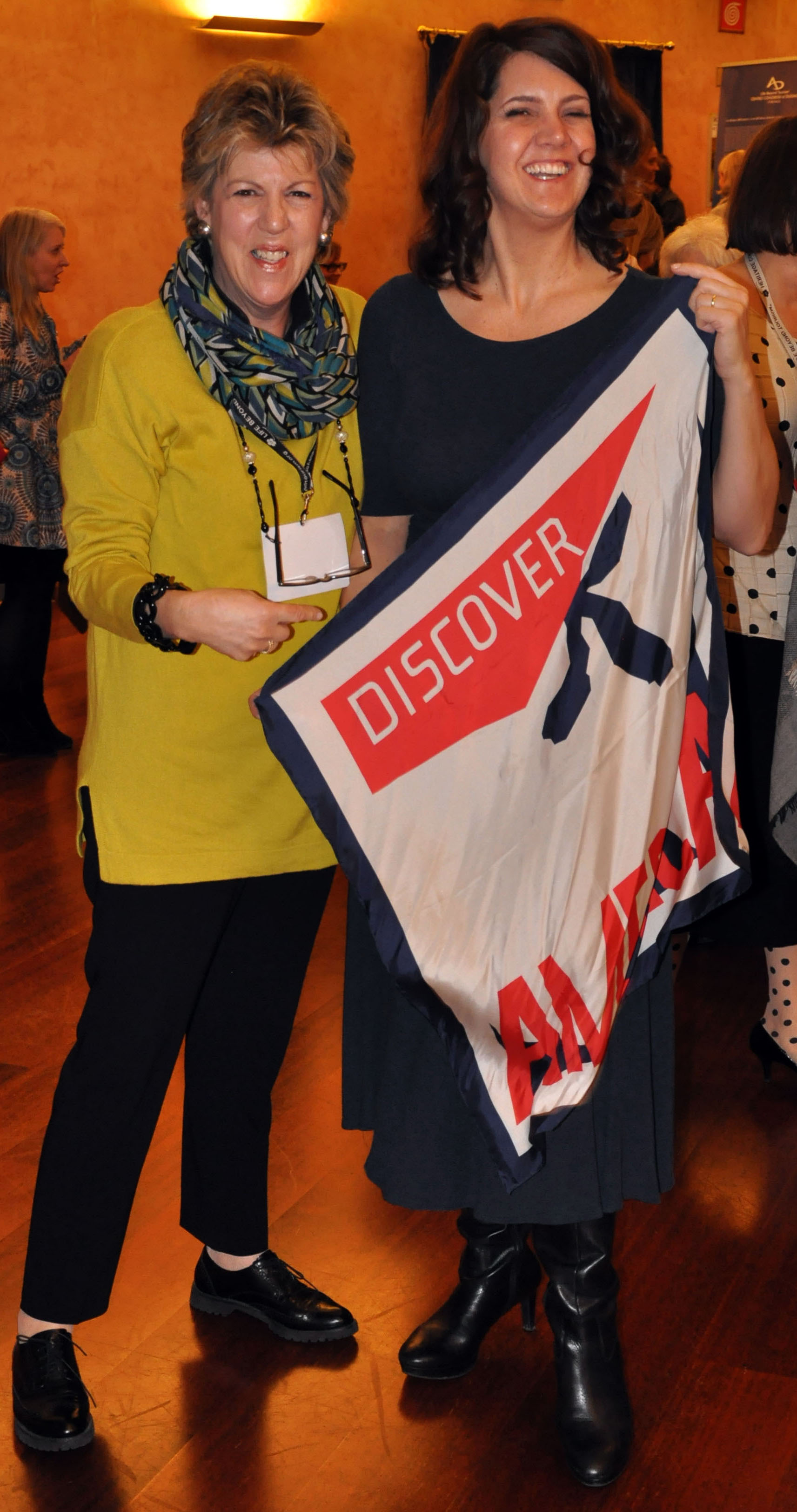
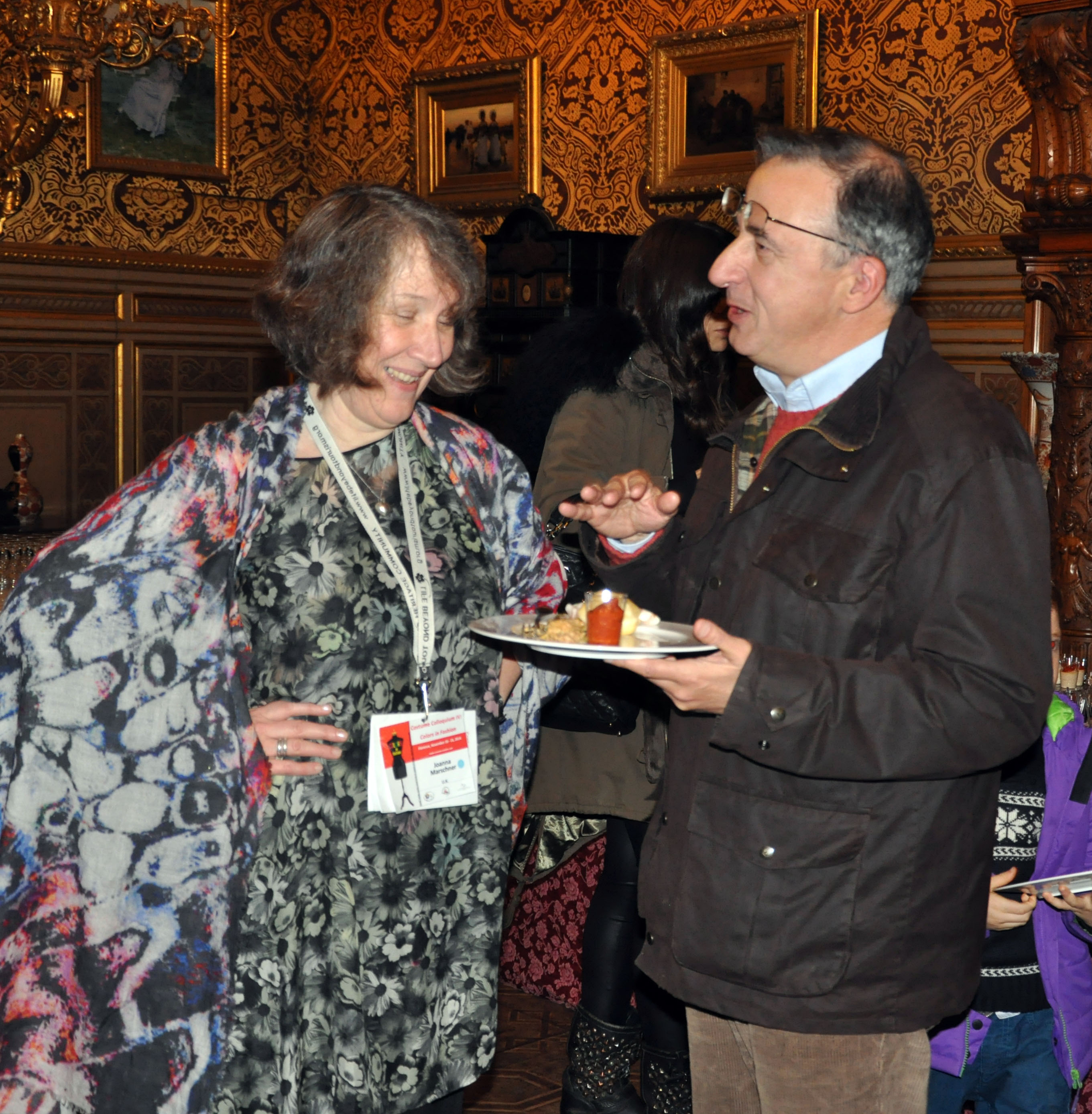
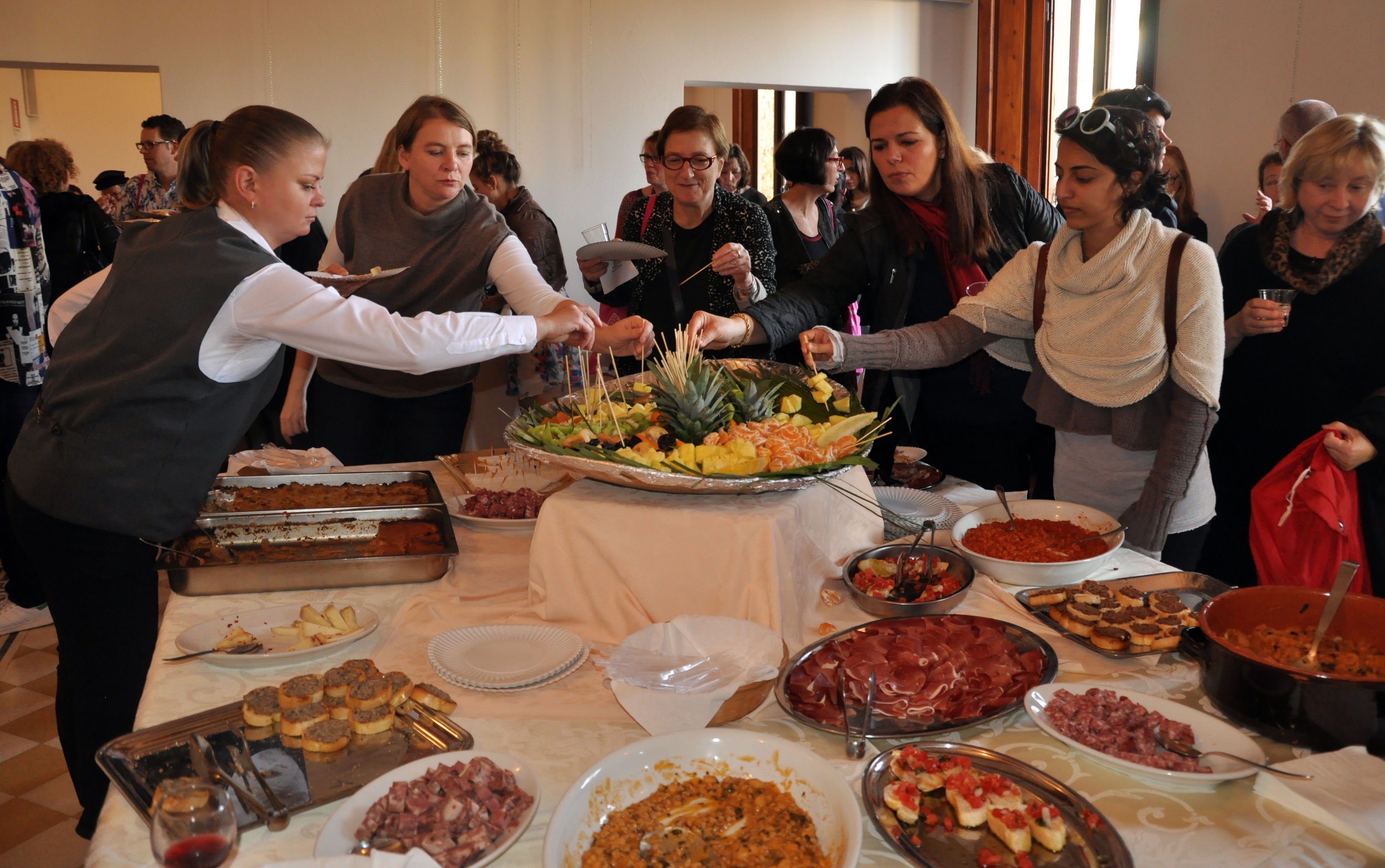
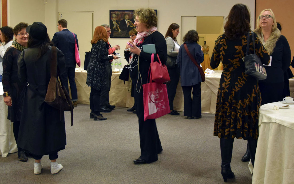
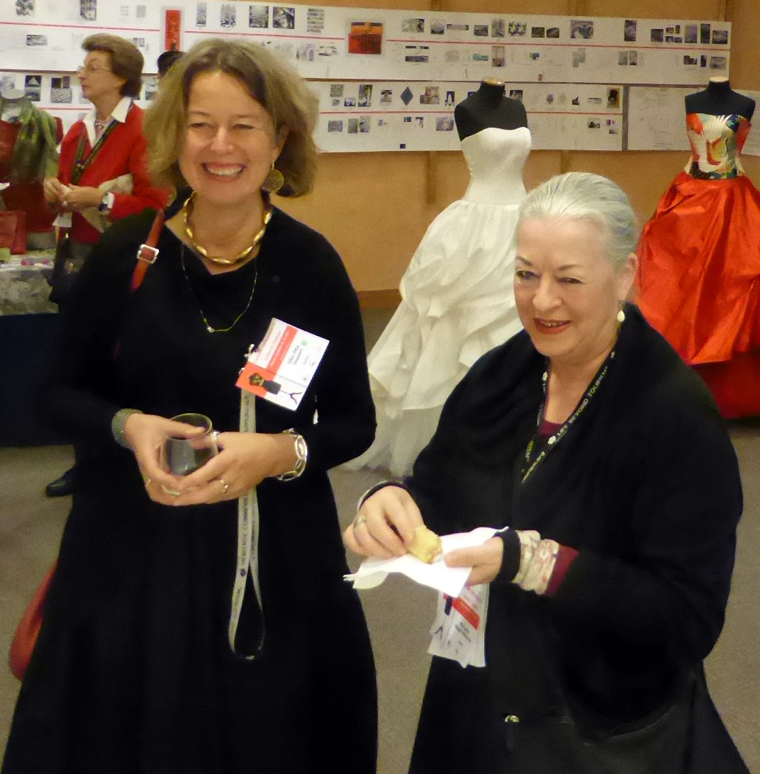
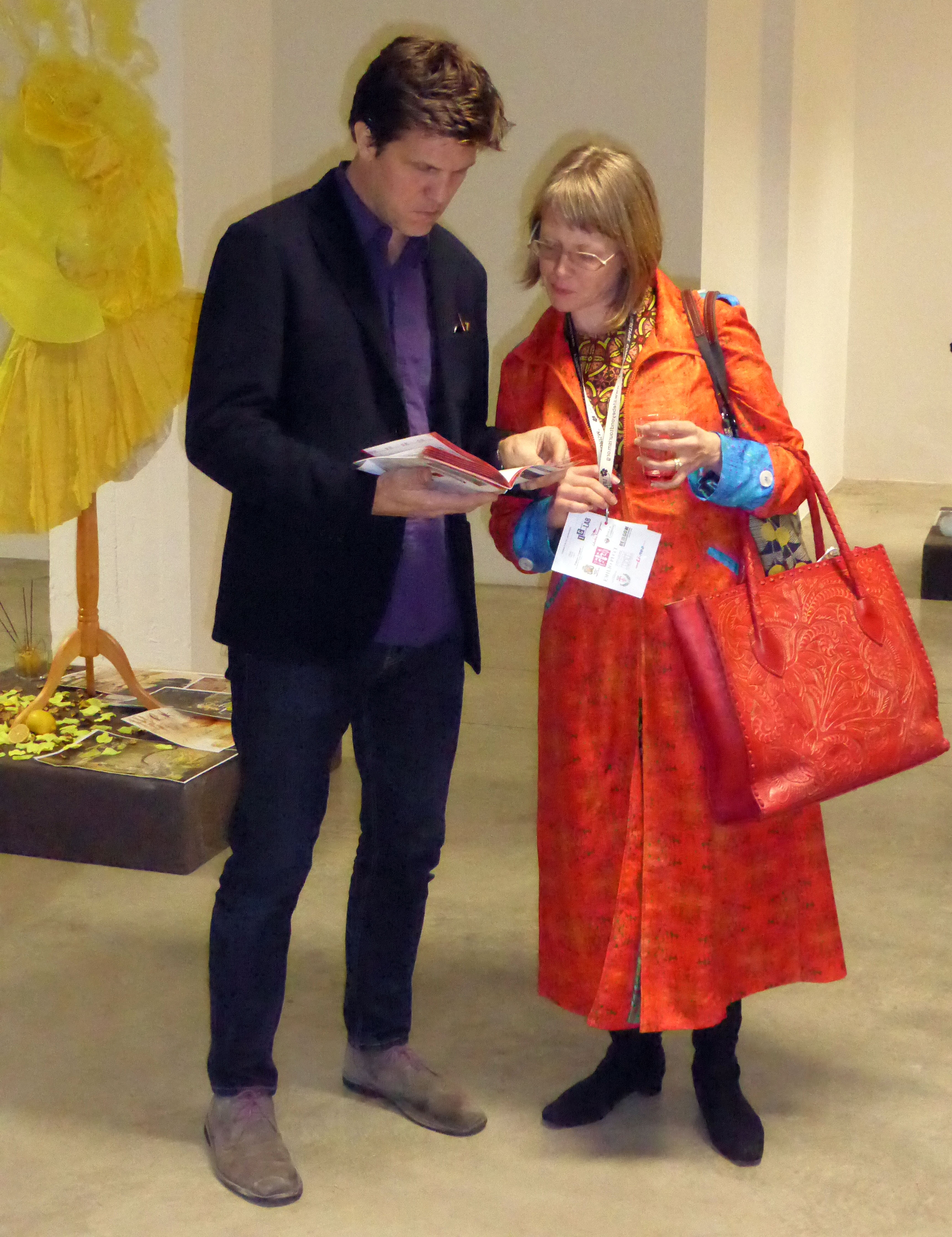
- Conversazioni e scambi di idee:

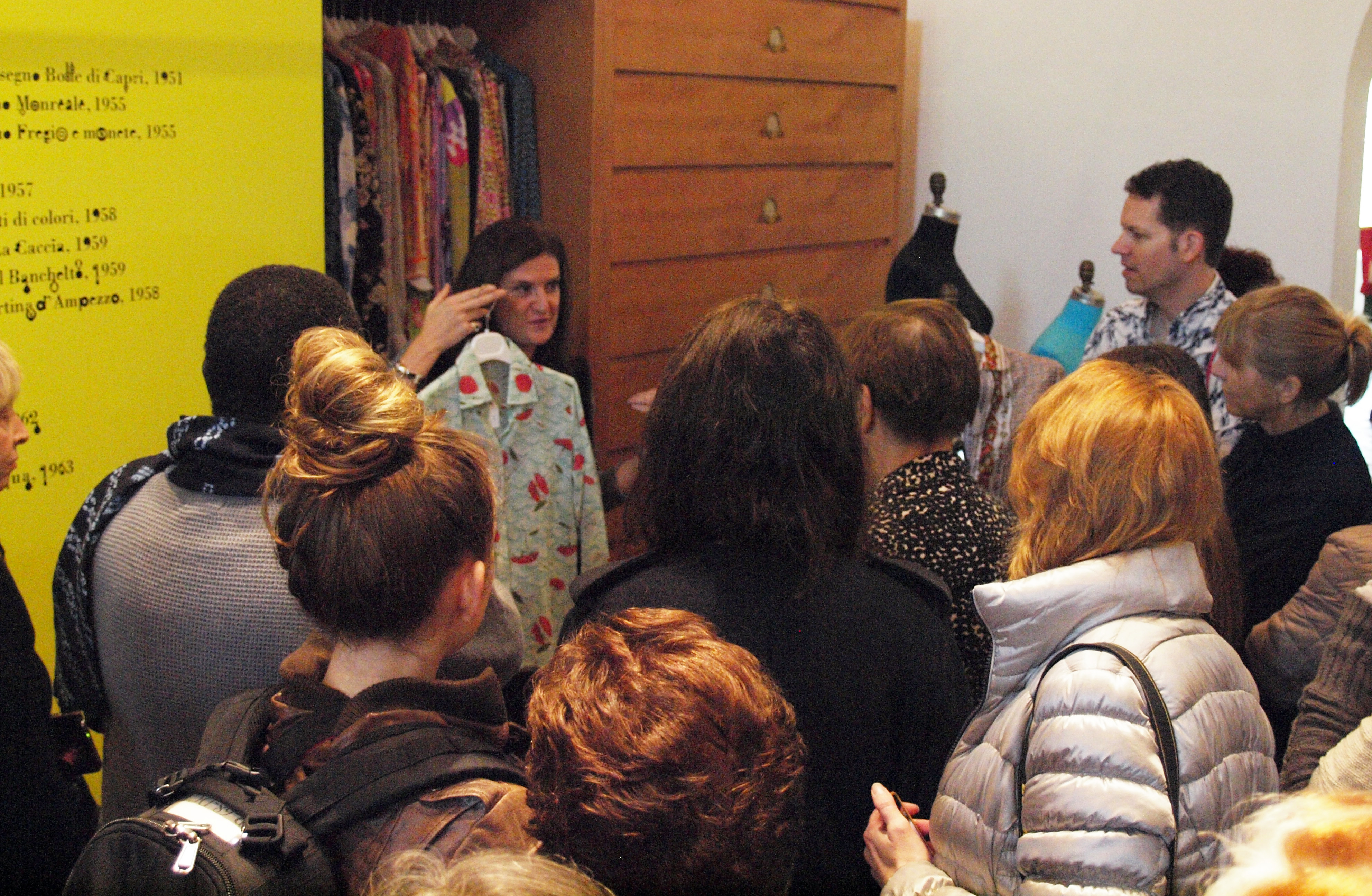
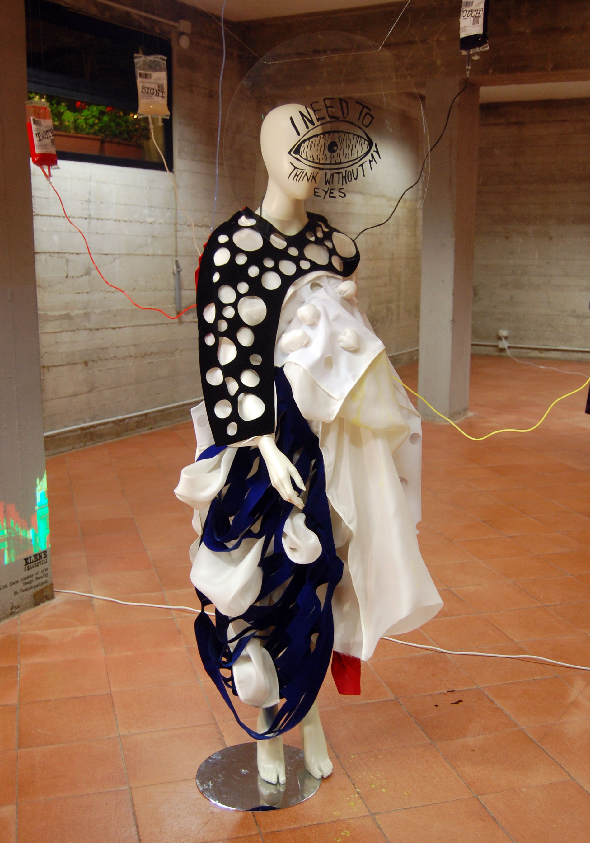
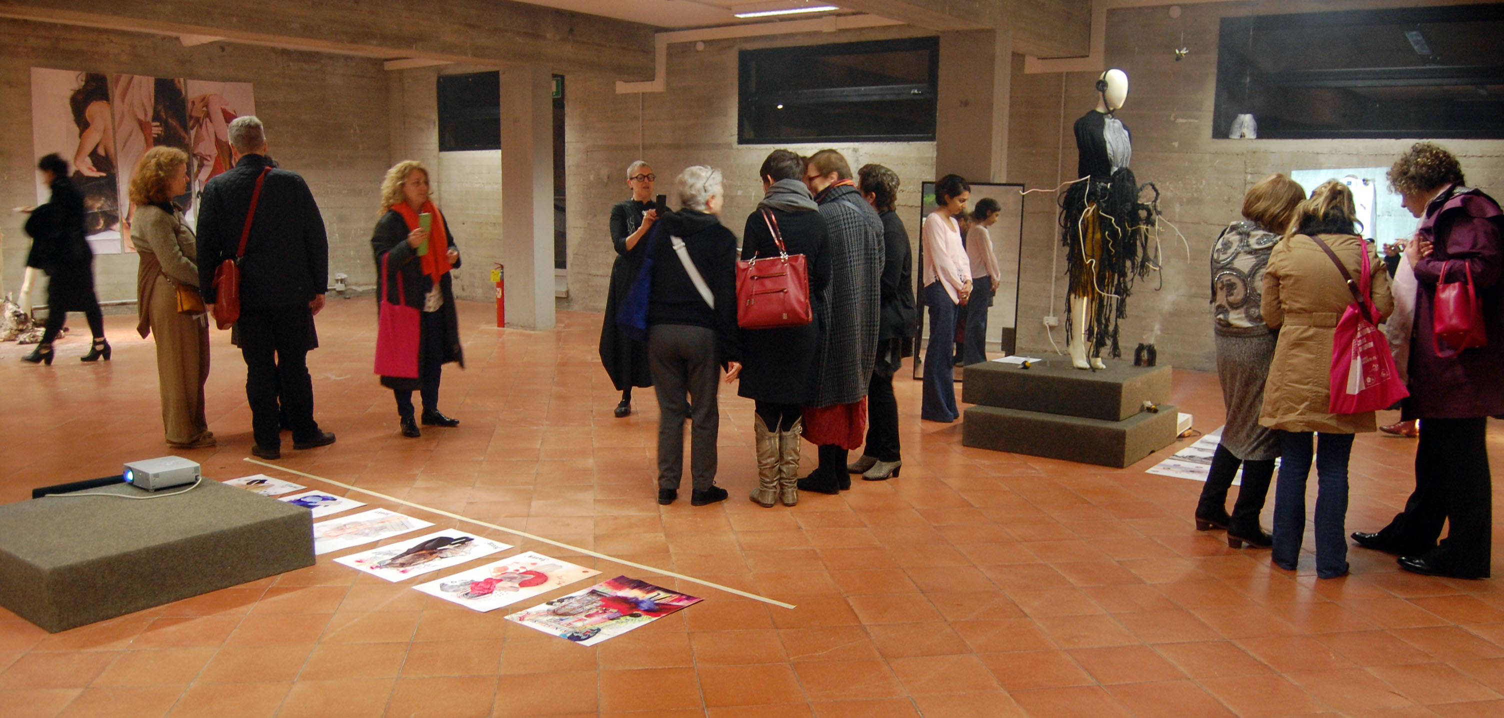
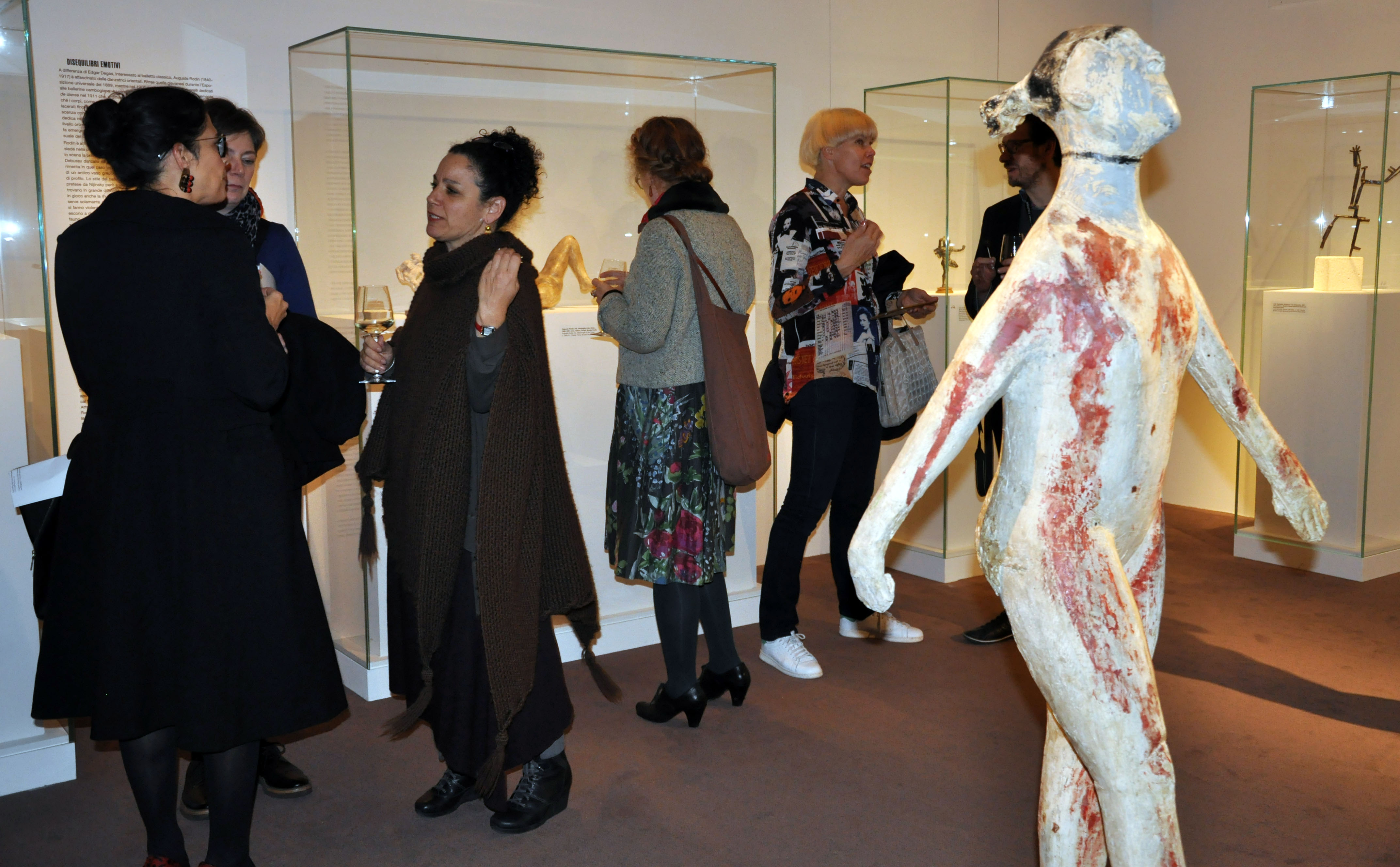
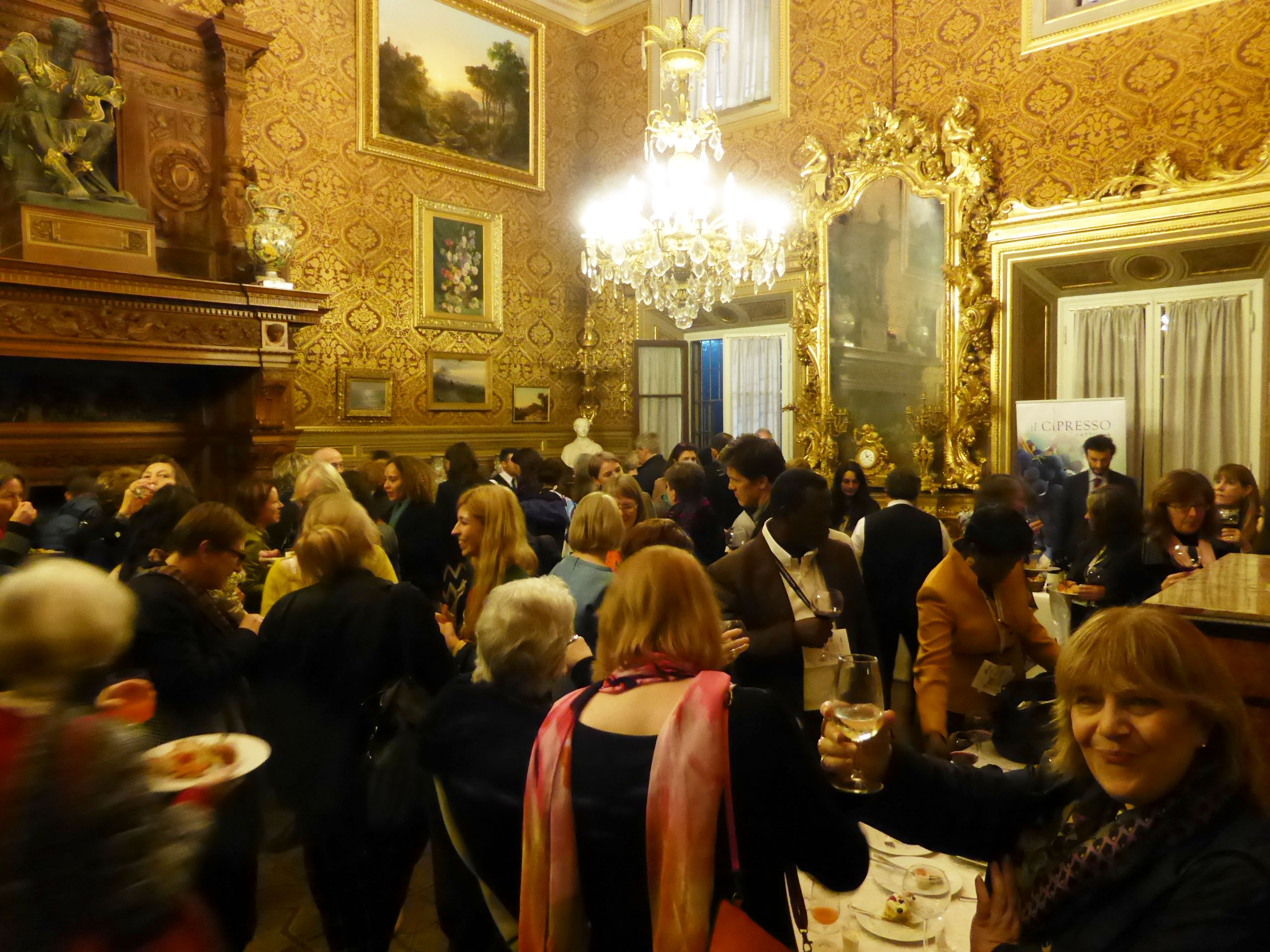
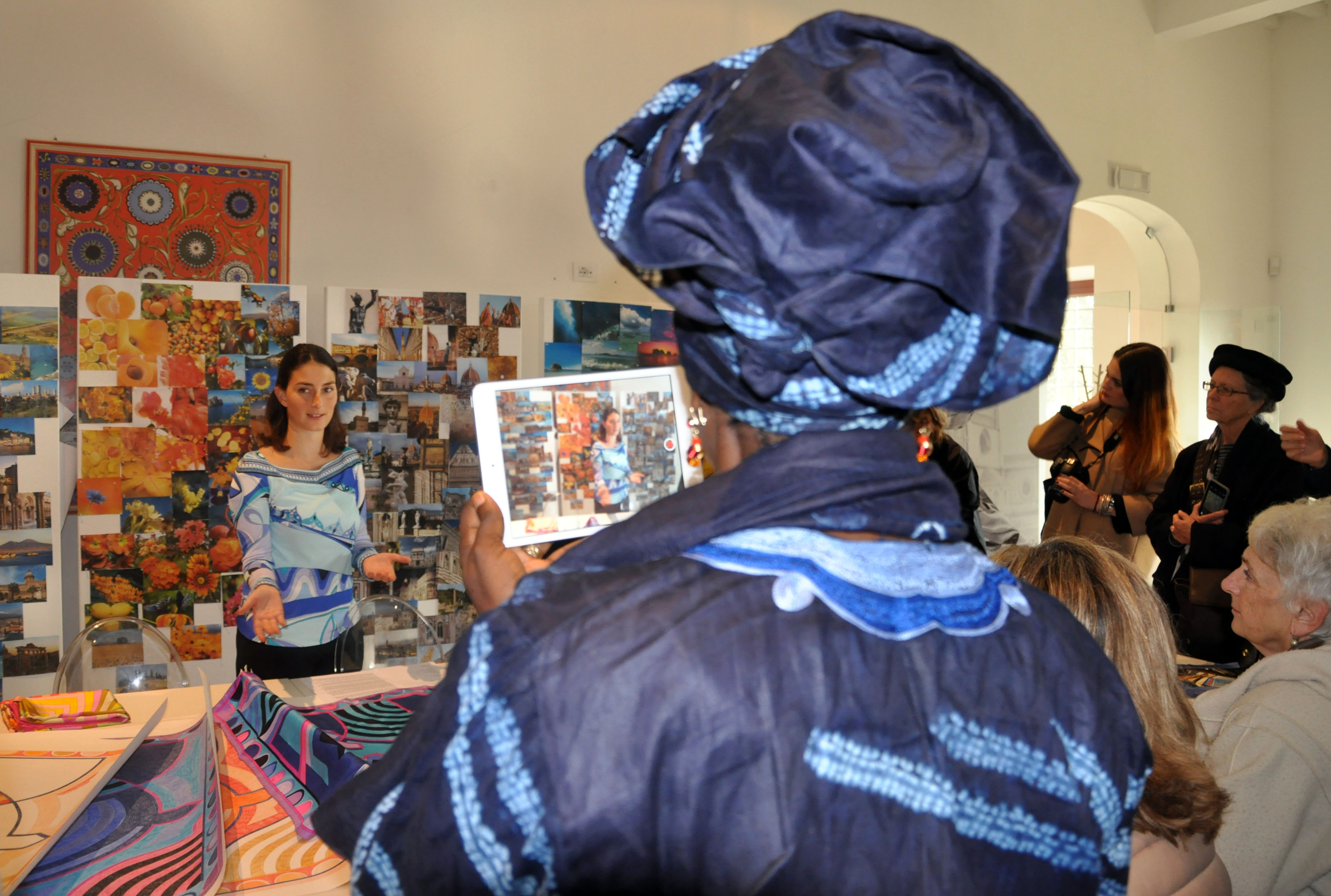
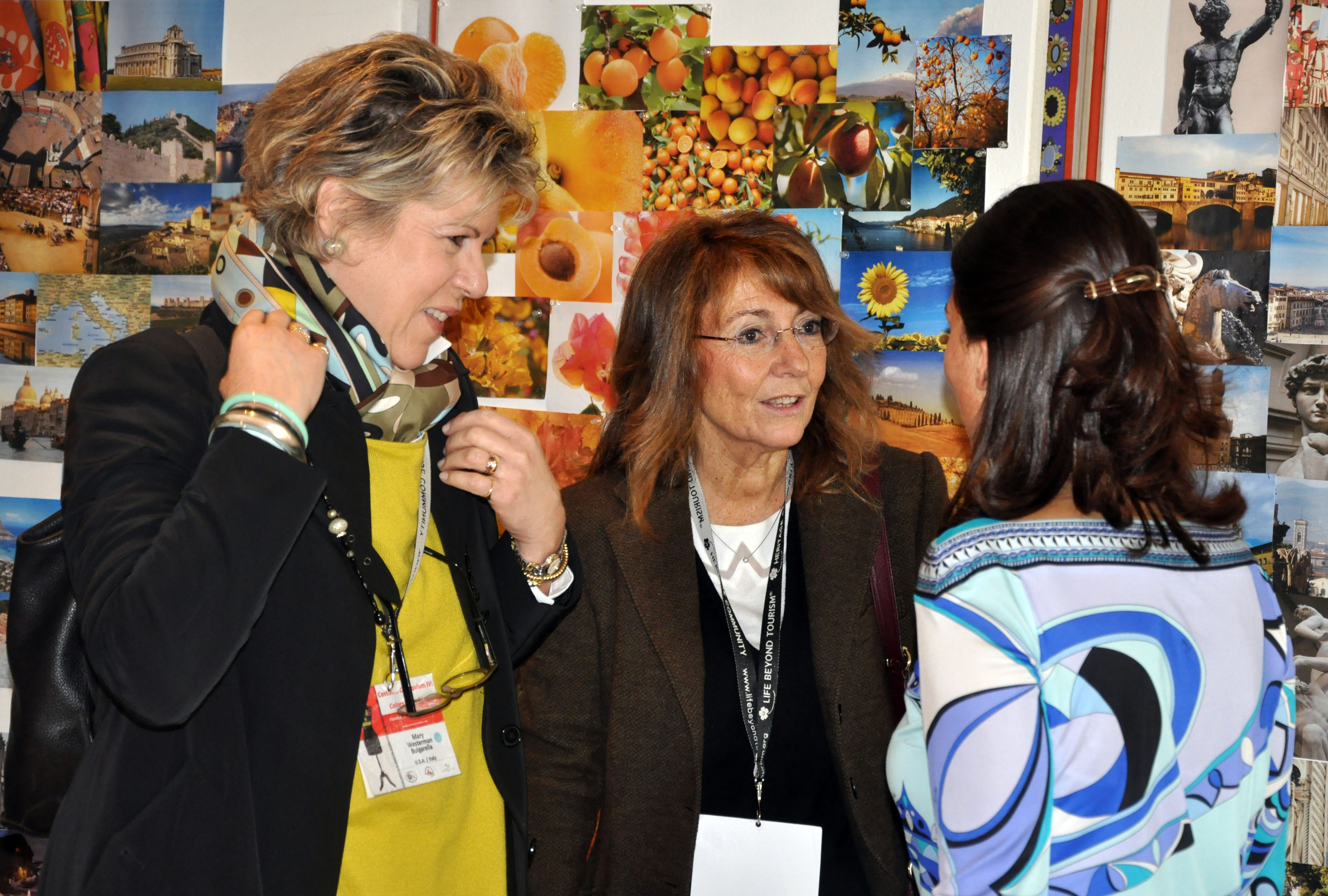
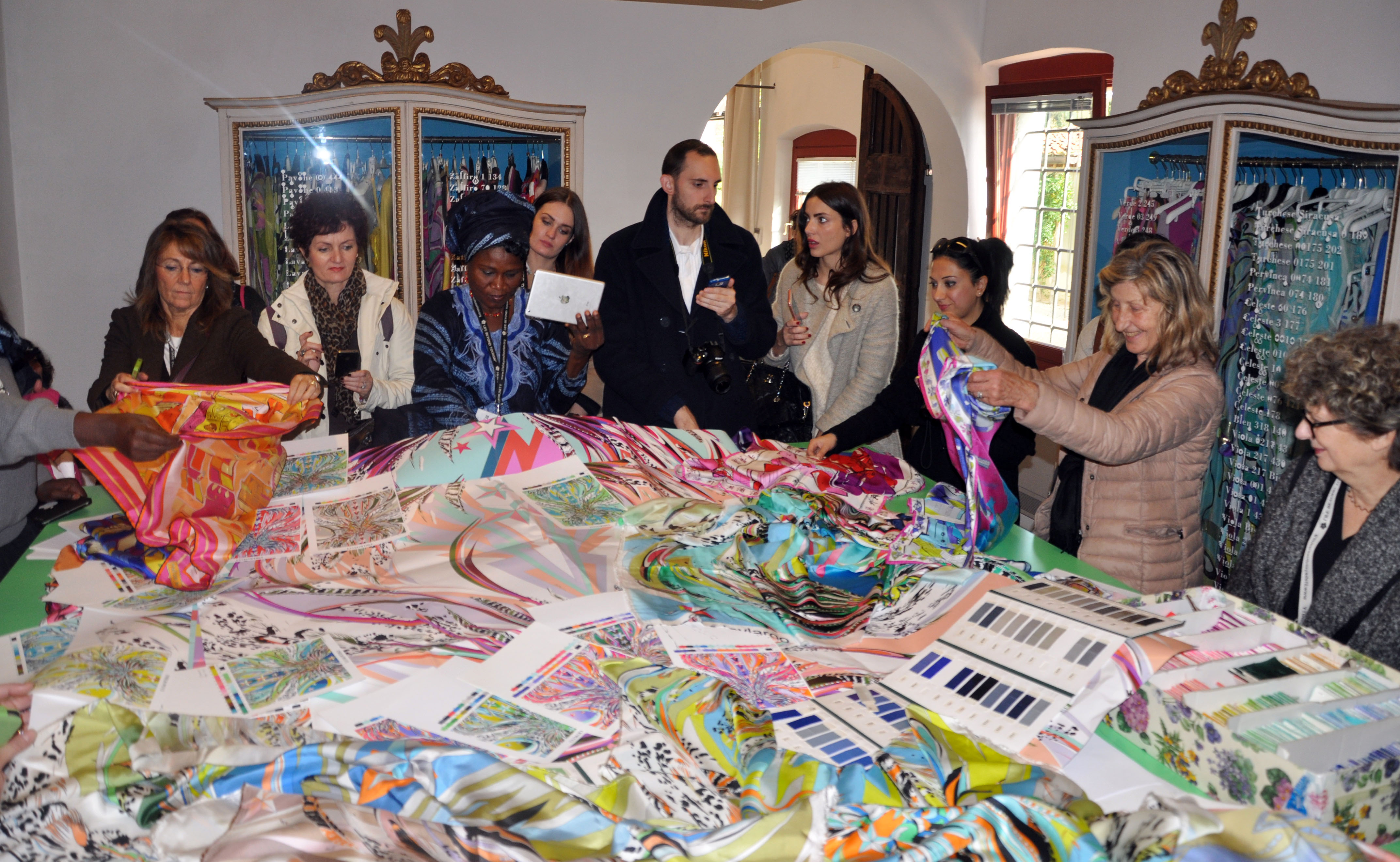
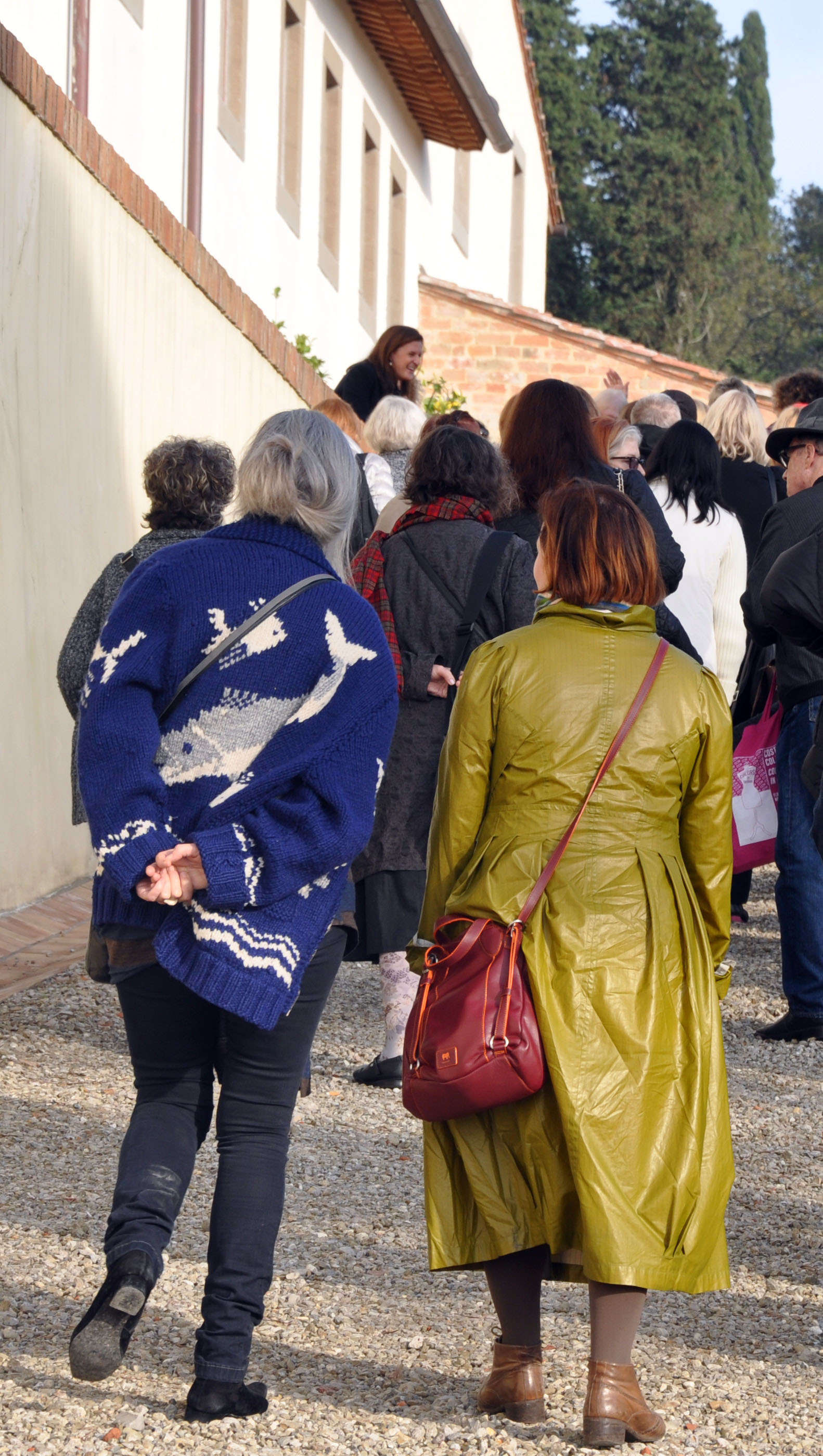
- Visite stimolanti ed esclusive:
Palazzo Coppini

ICLab (Intercultural Creativity Laboratory)
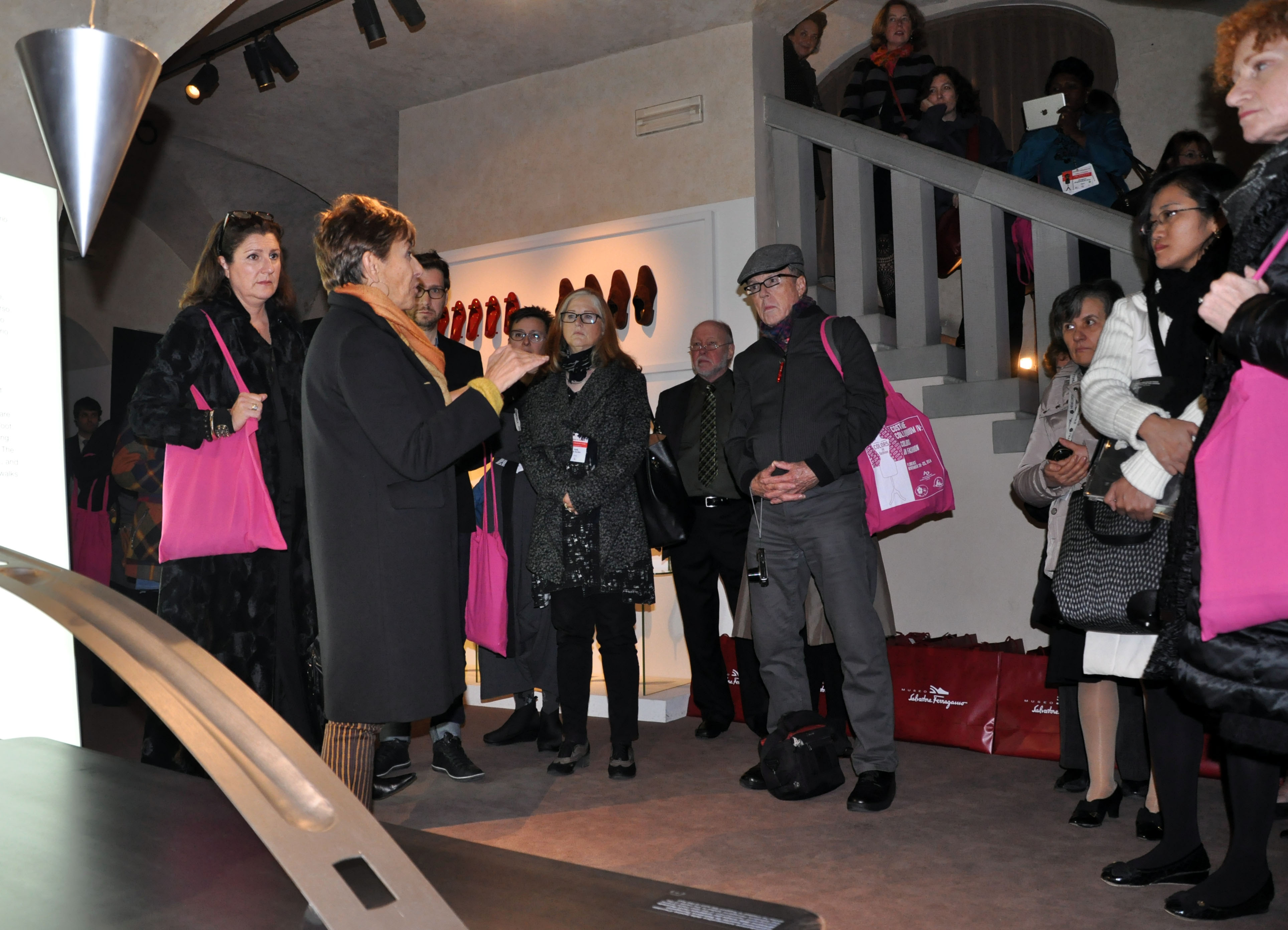
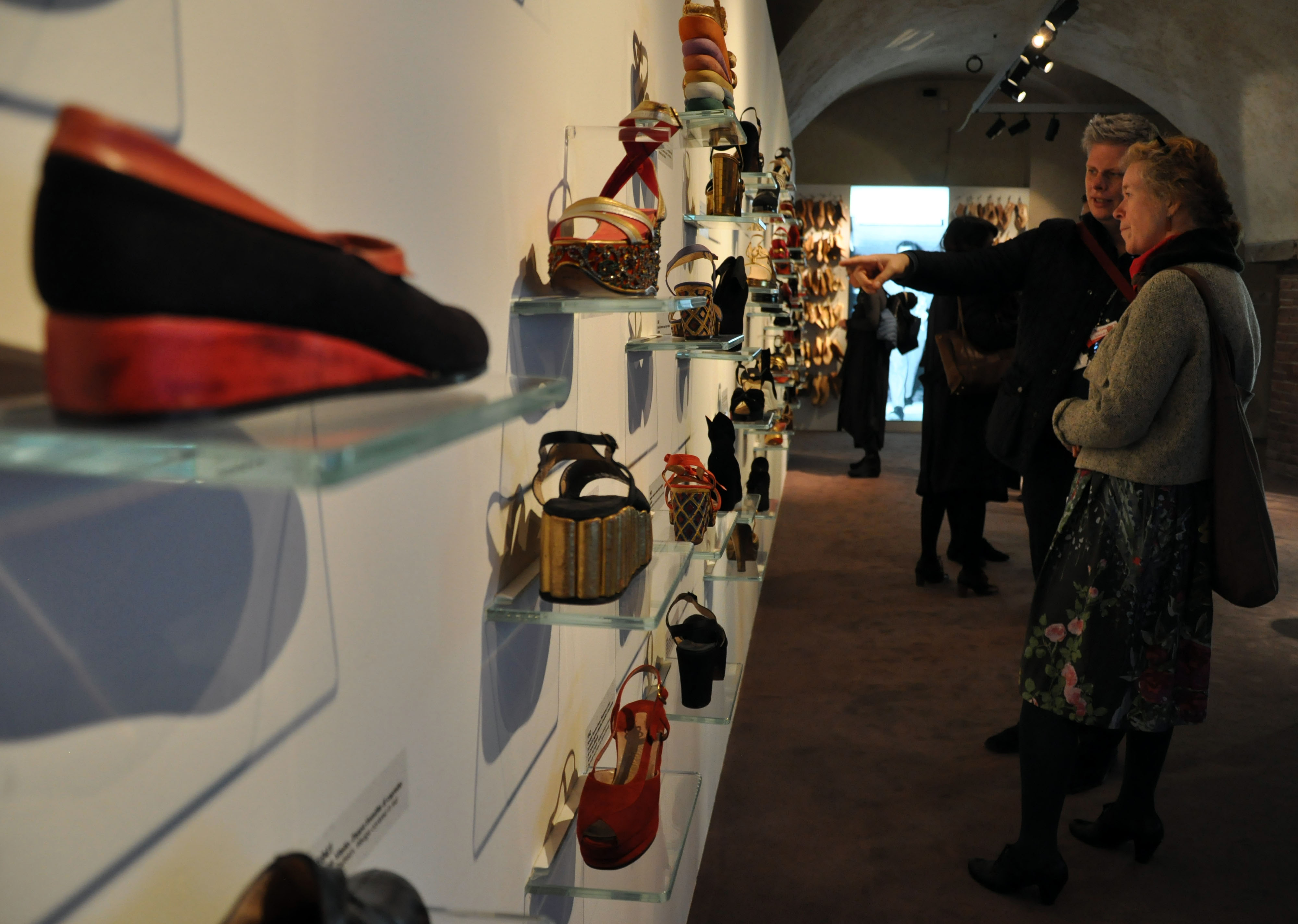
Museo Salvatore Ferragamo


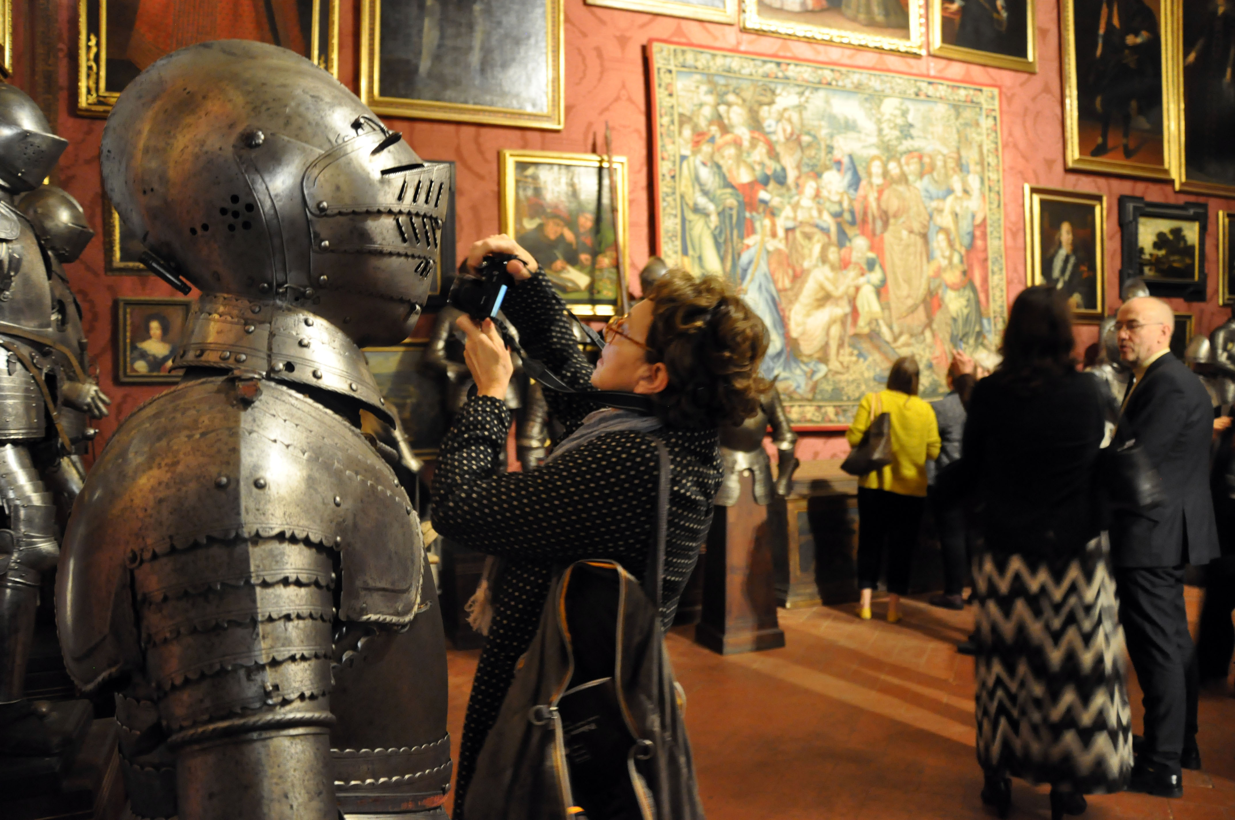
Museo Stibbert

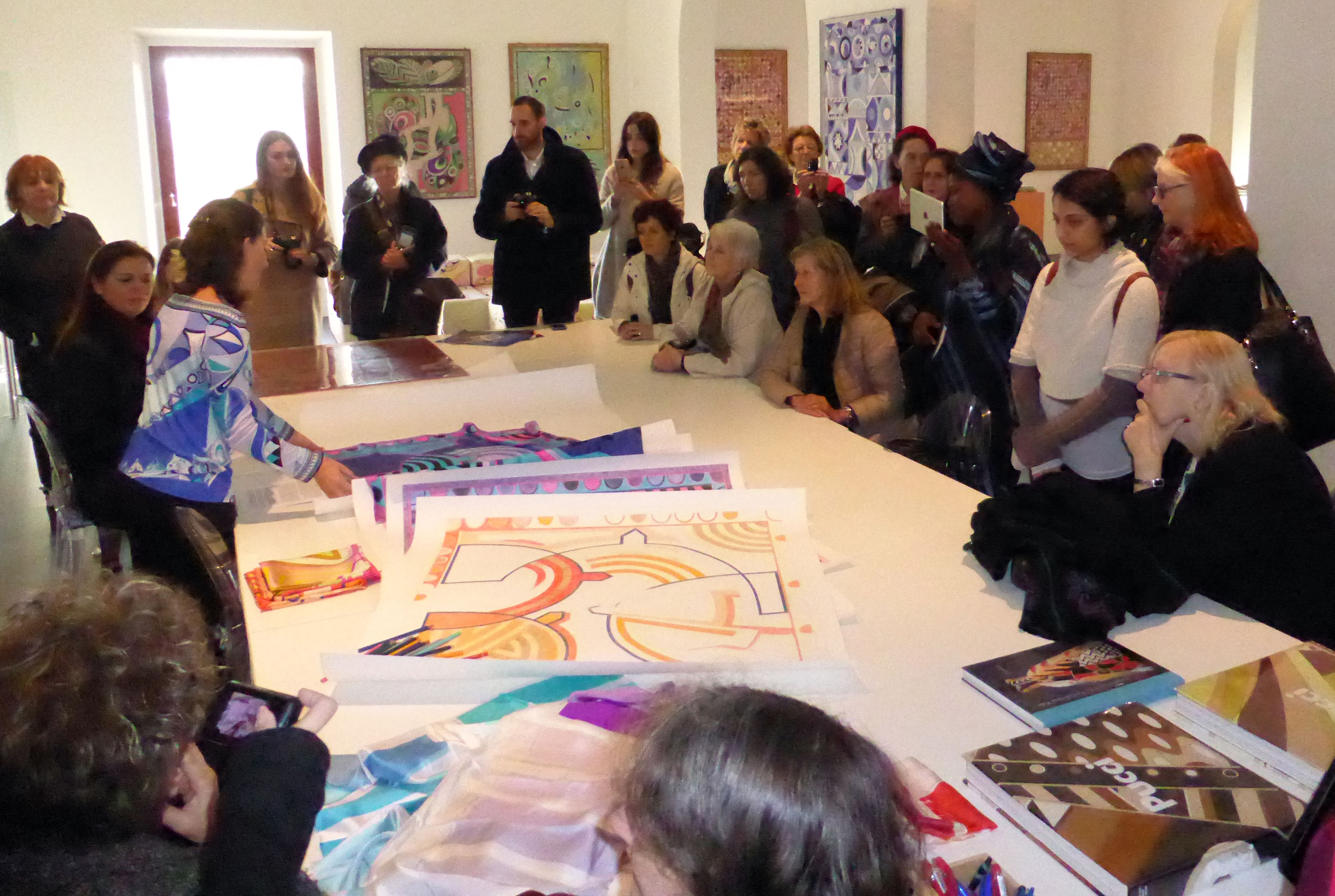
Museo Pucci, Archivio e Talent Center


![]()
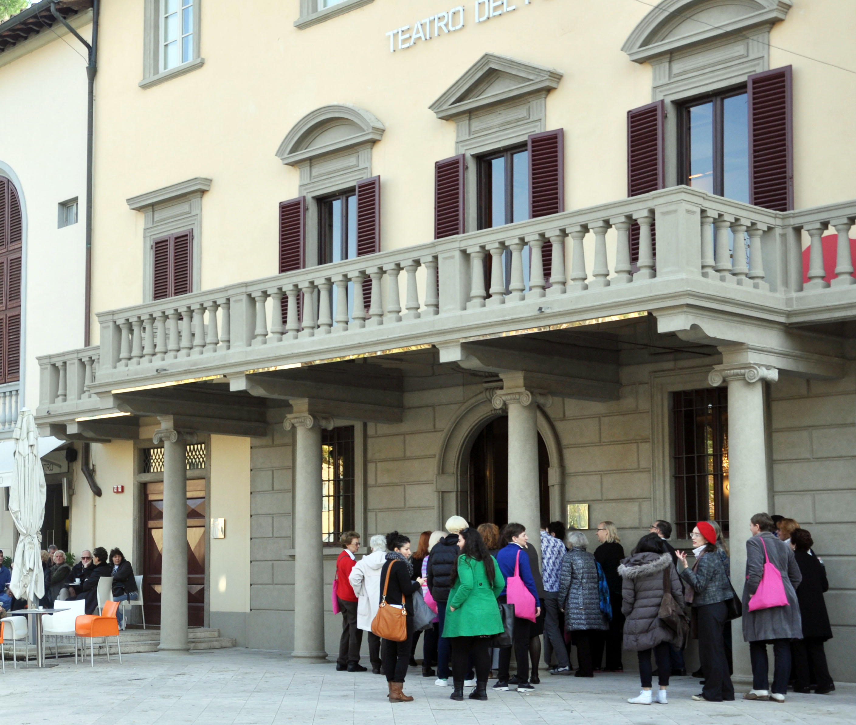
Teatro del Popolo di Castelfiorentino

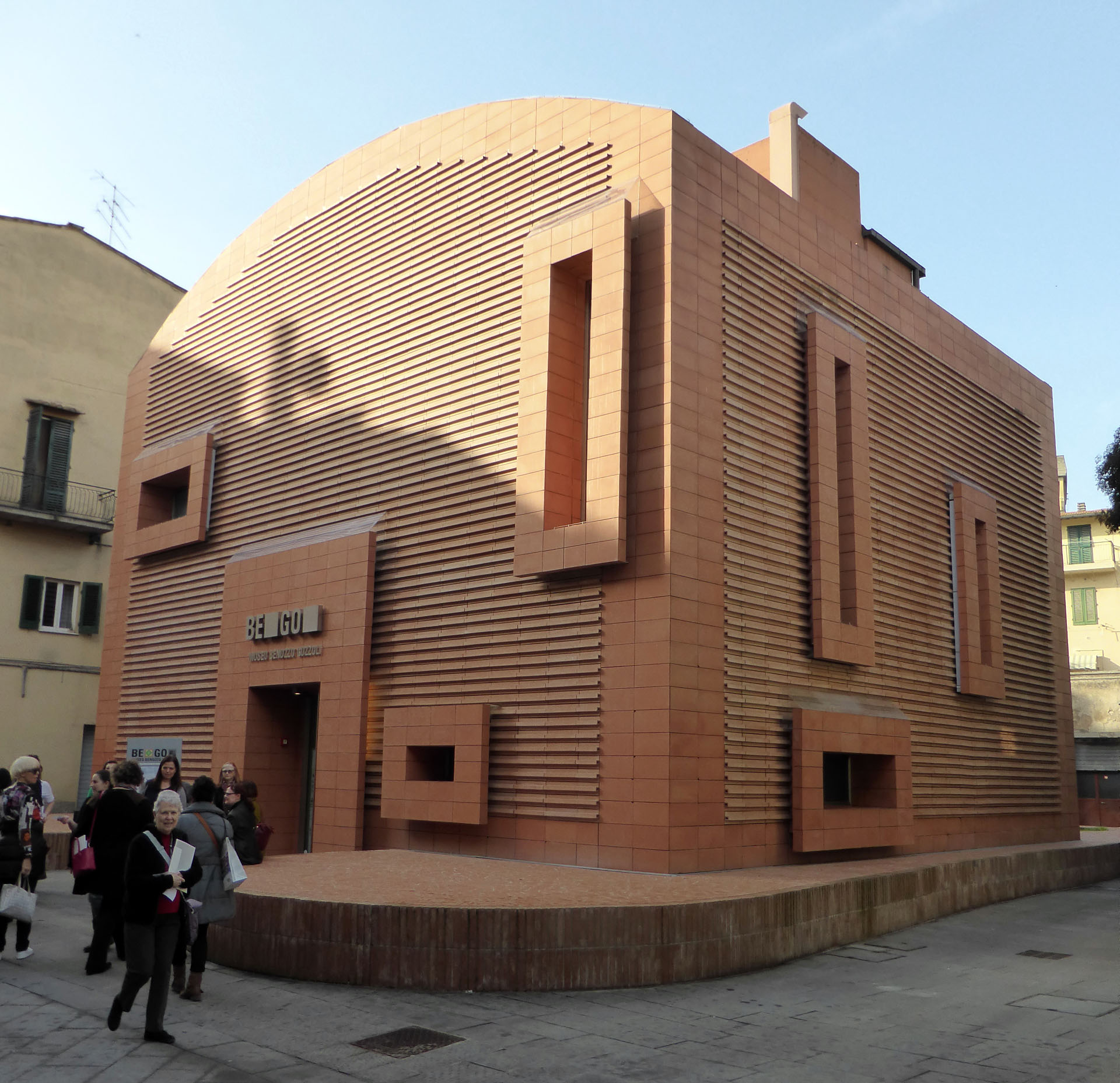
BEGO – Museo Benozzo Gozzoli
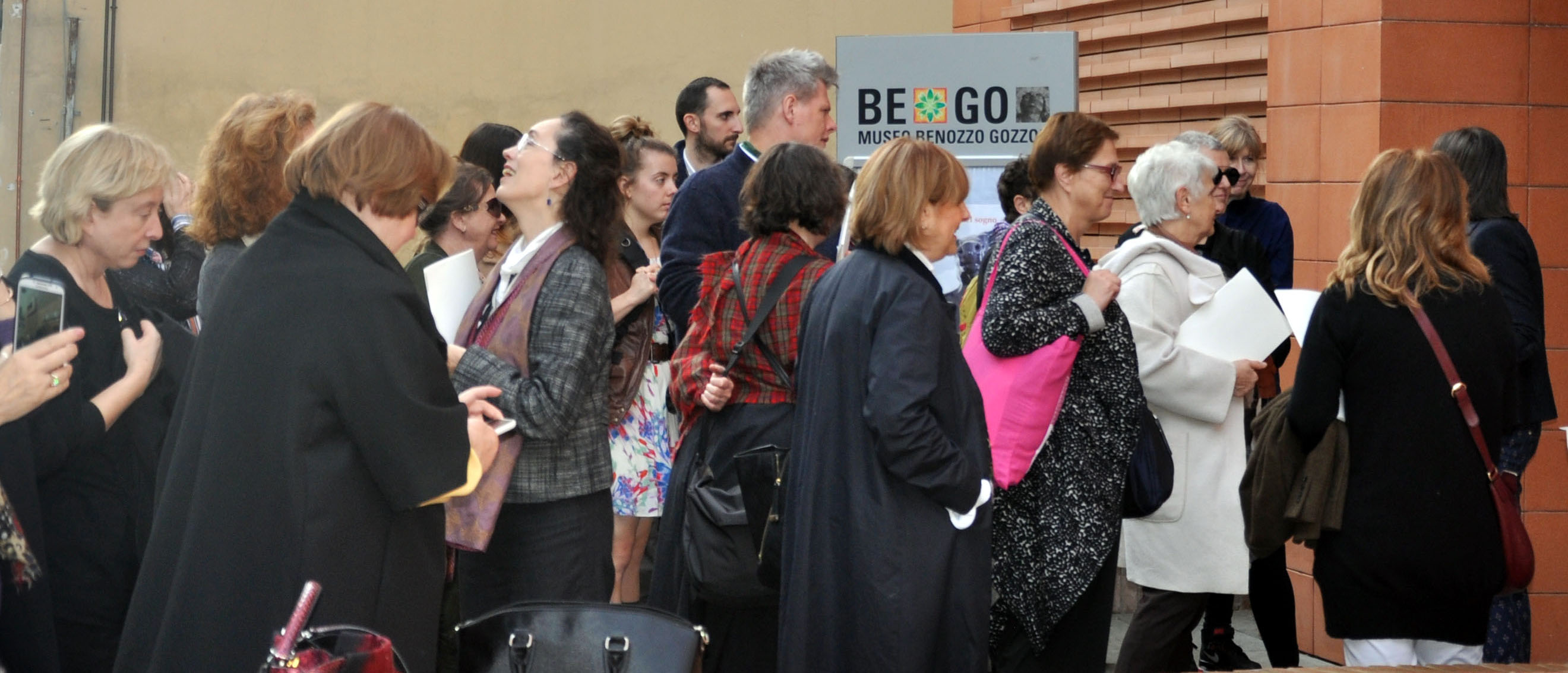

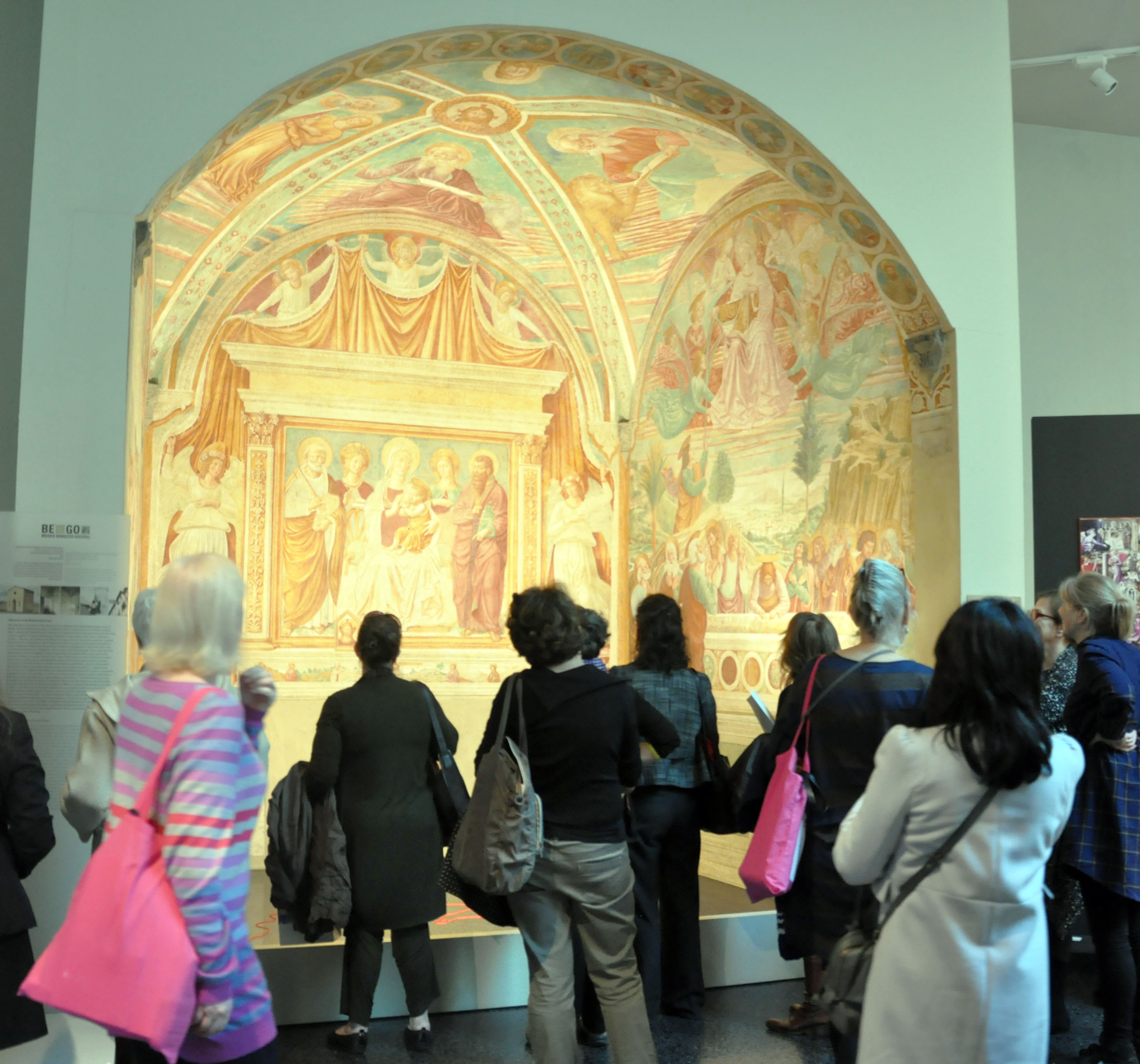
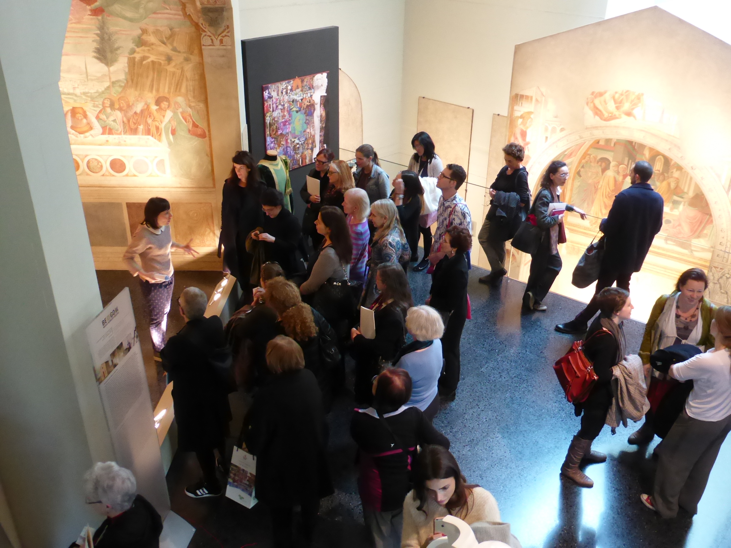
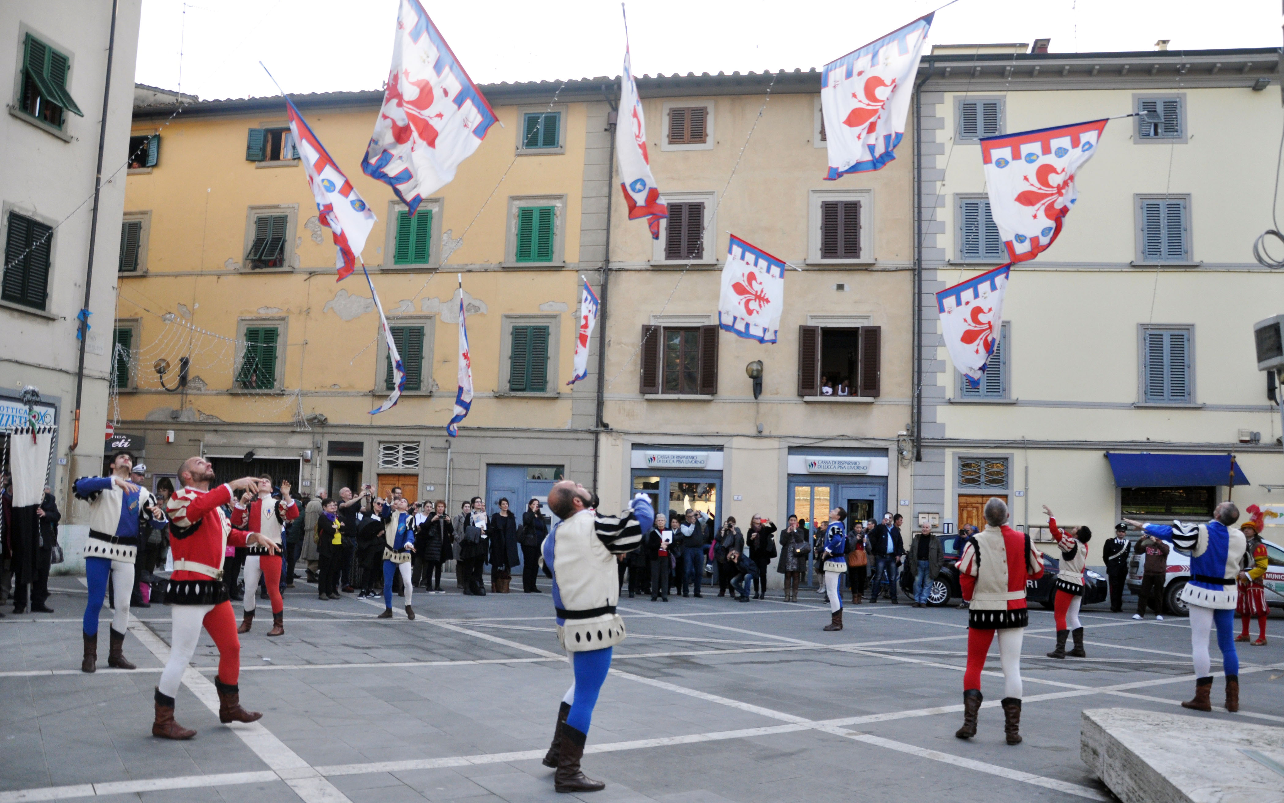
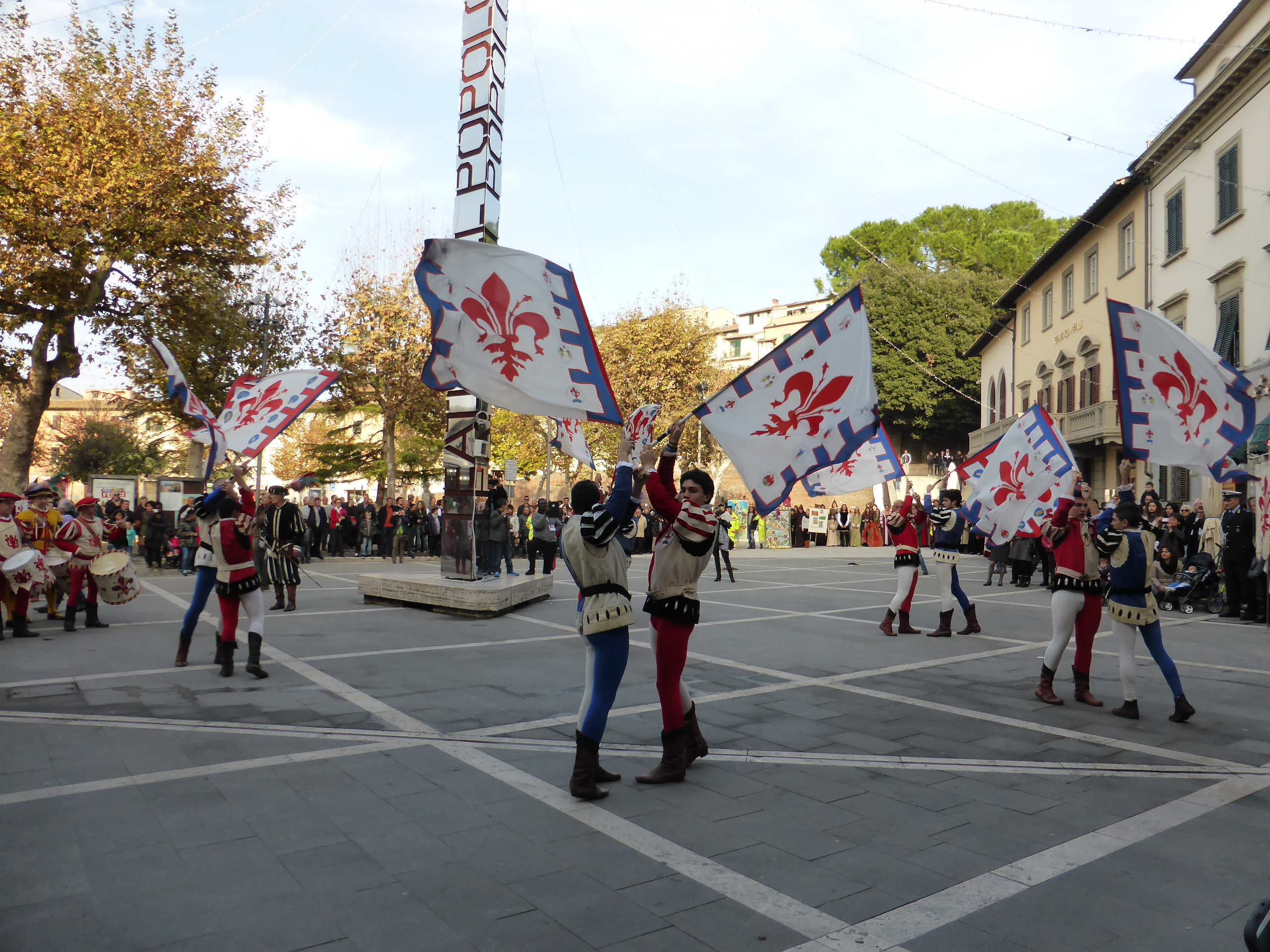
Castelfiorentino
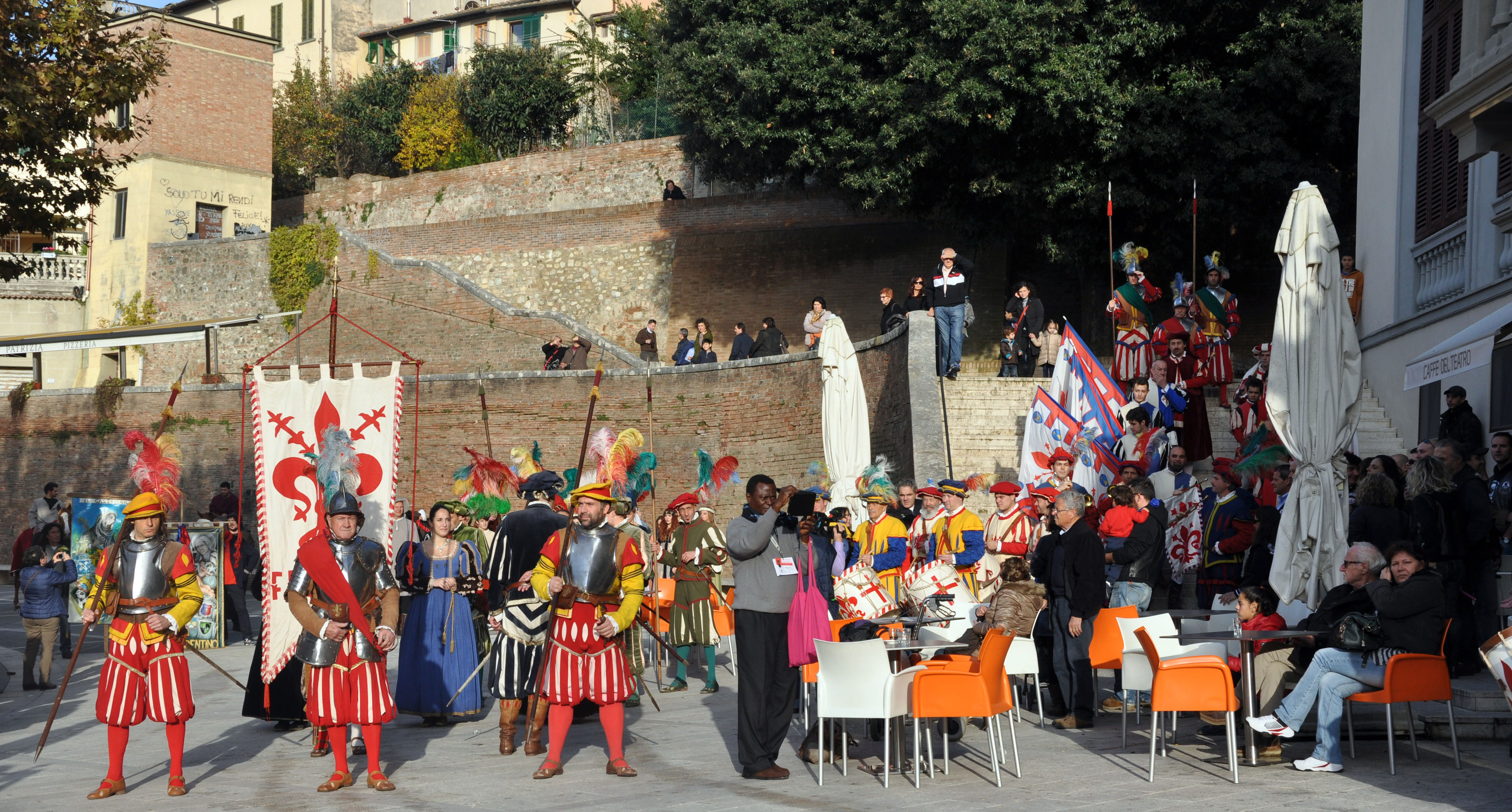
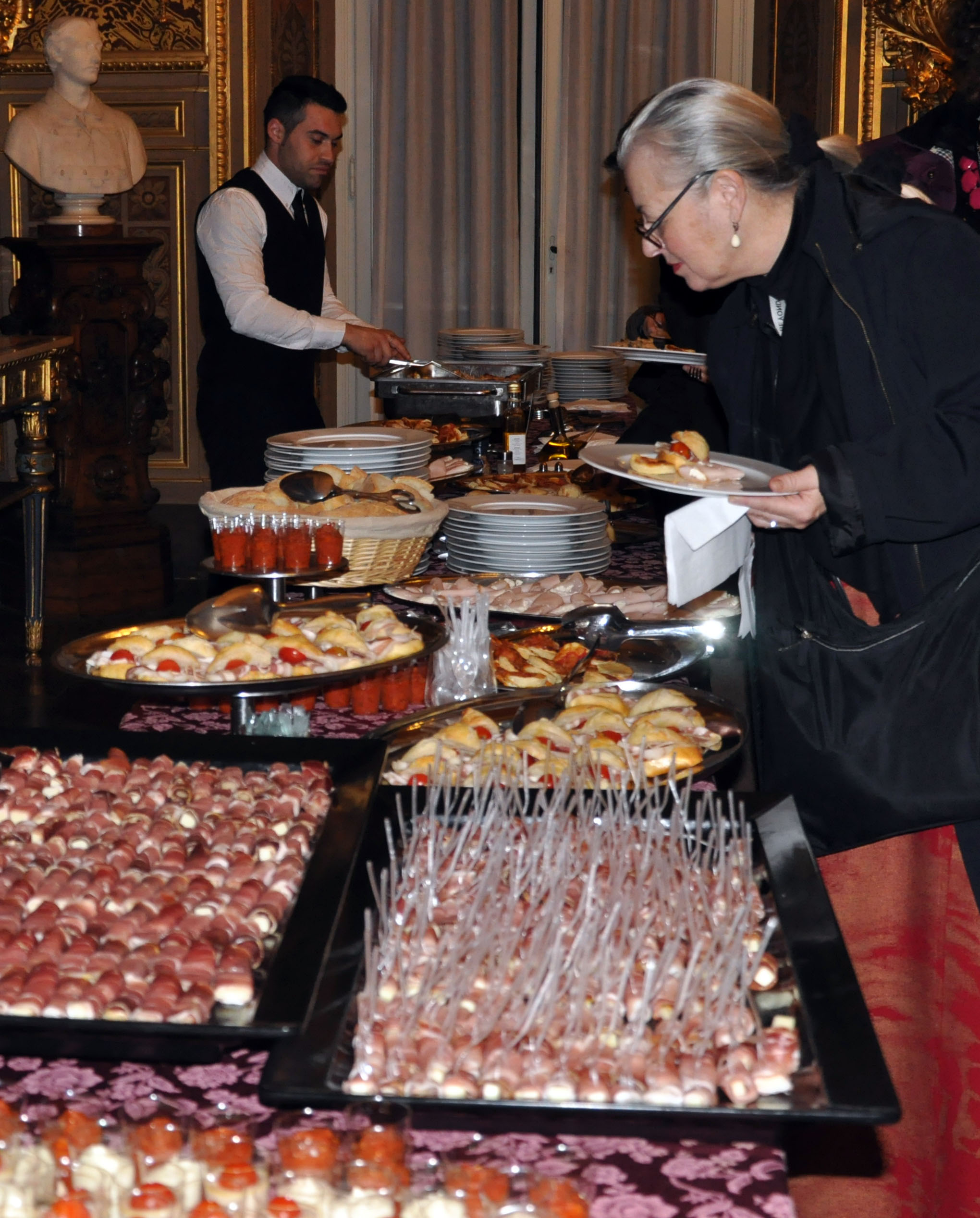
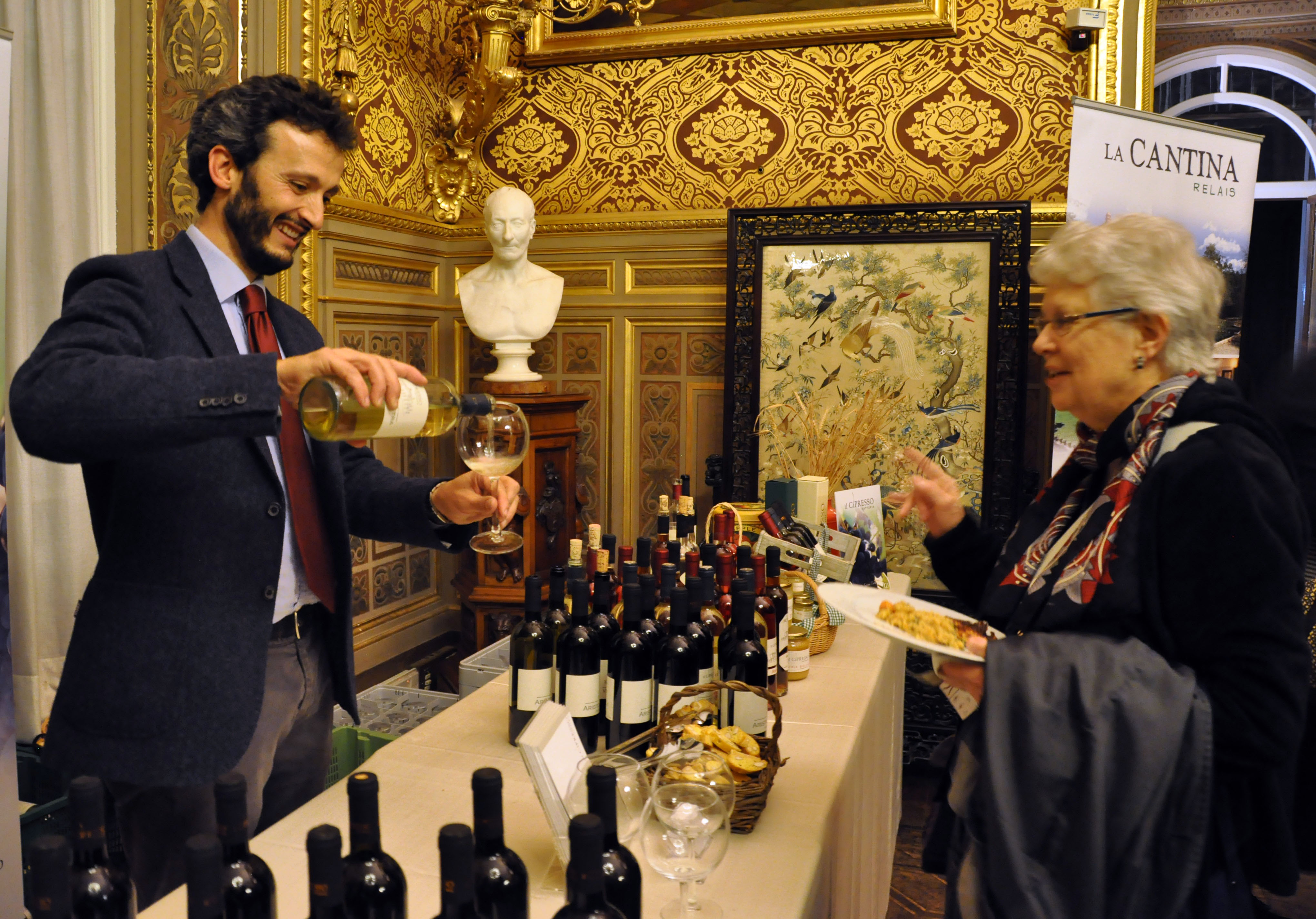
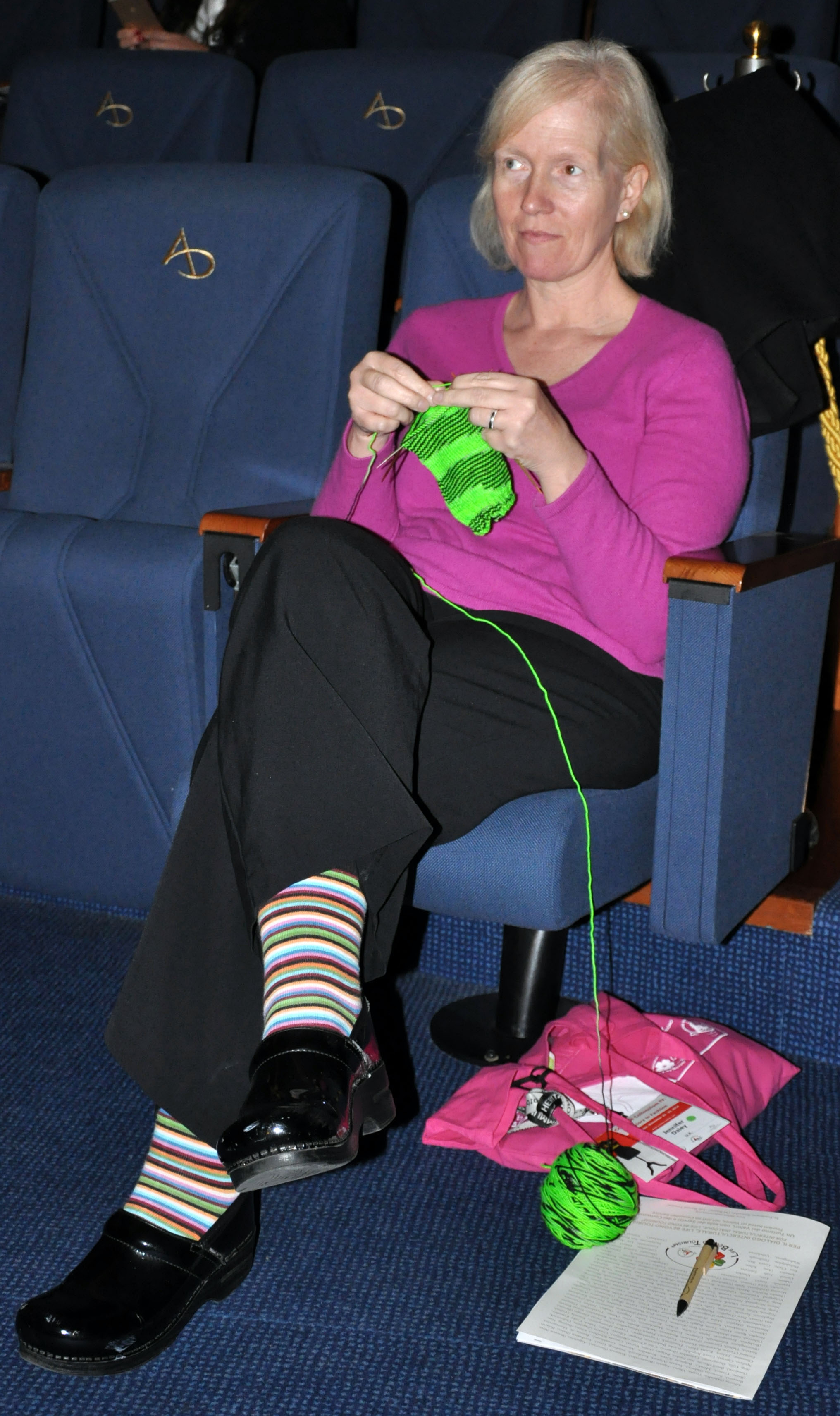
- Momenti di relax e divertimento:


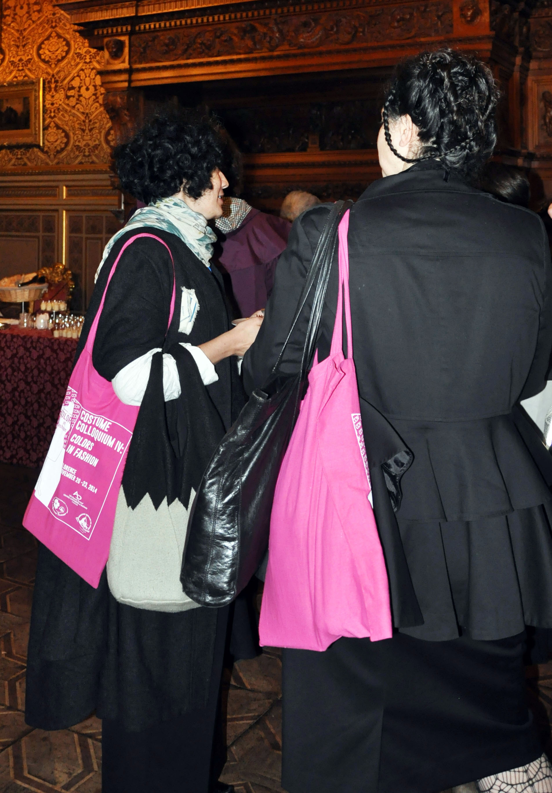
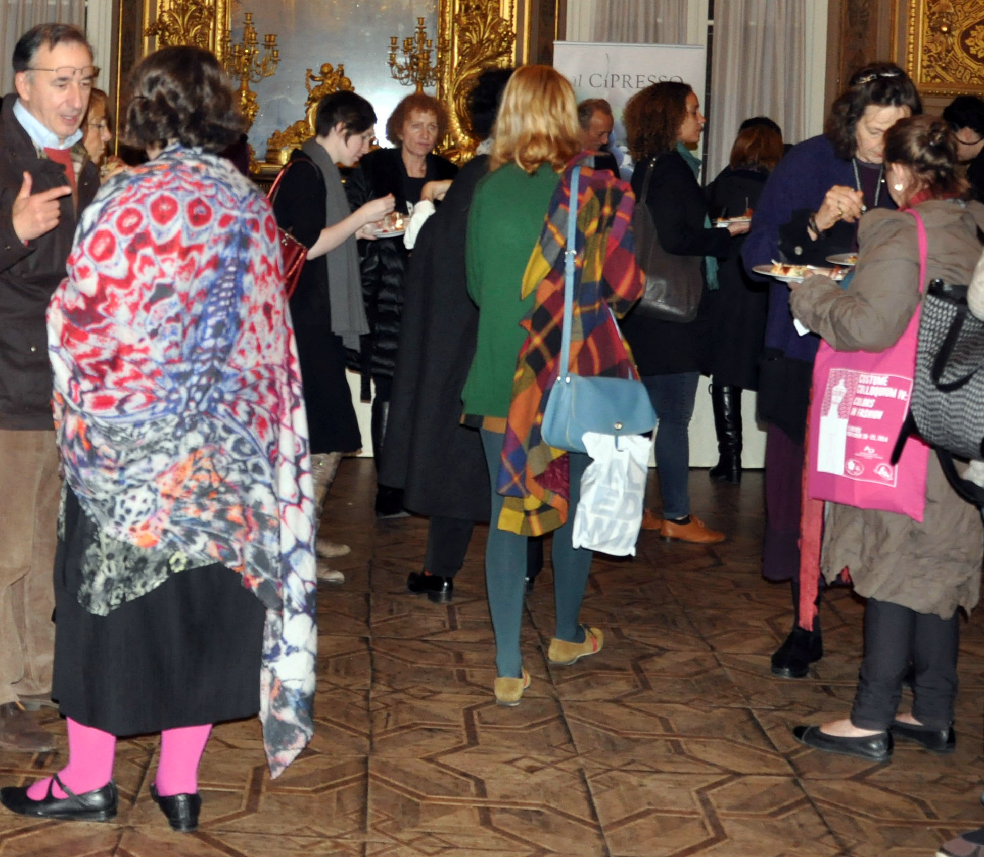
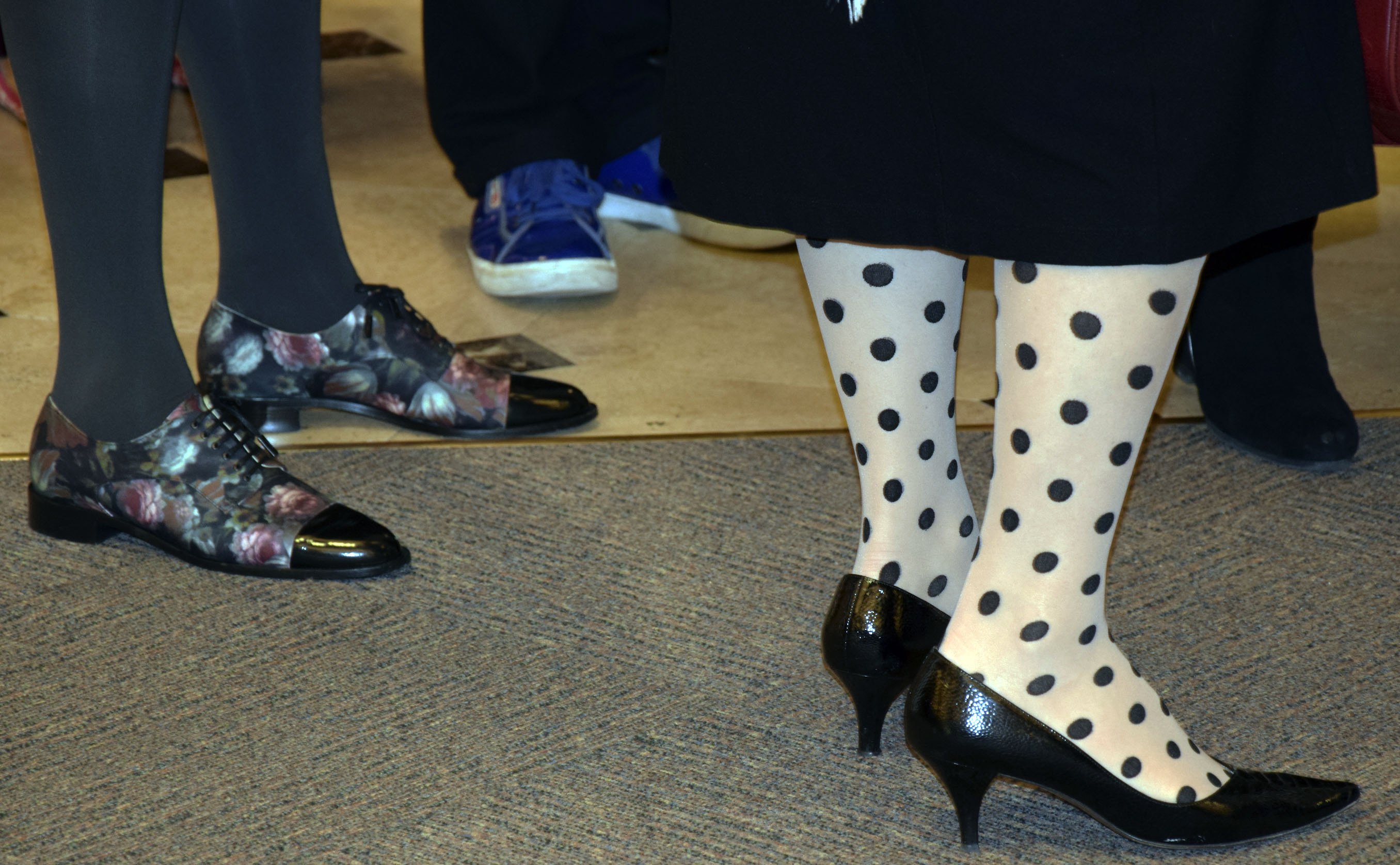
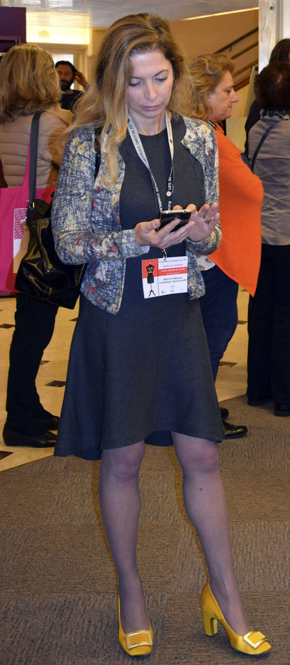
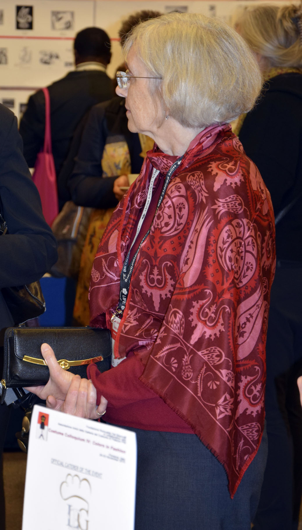
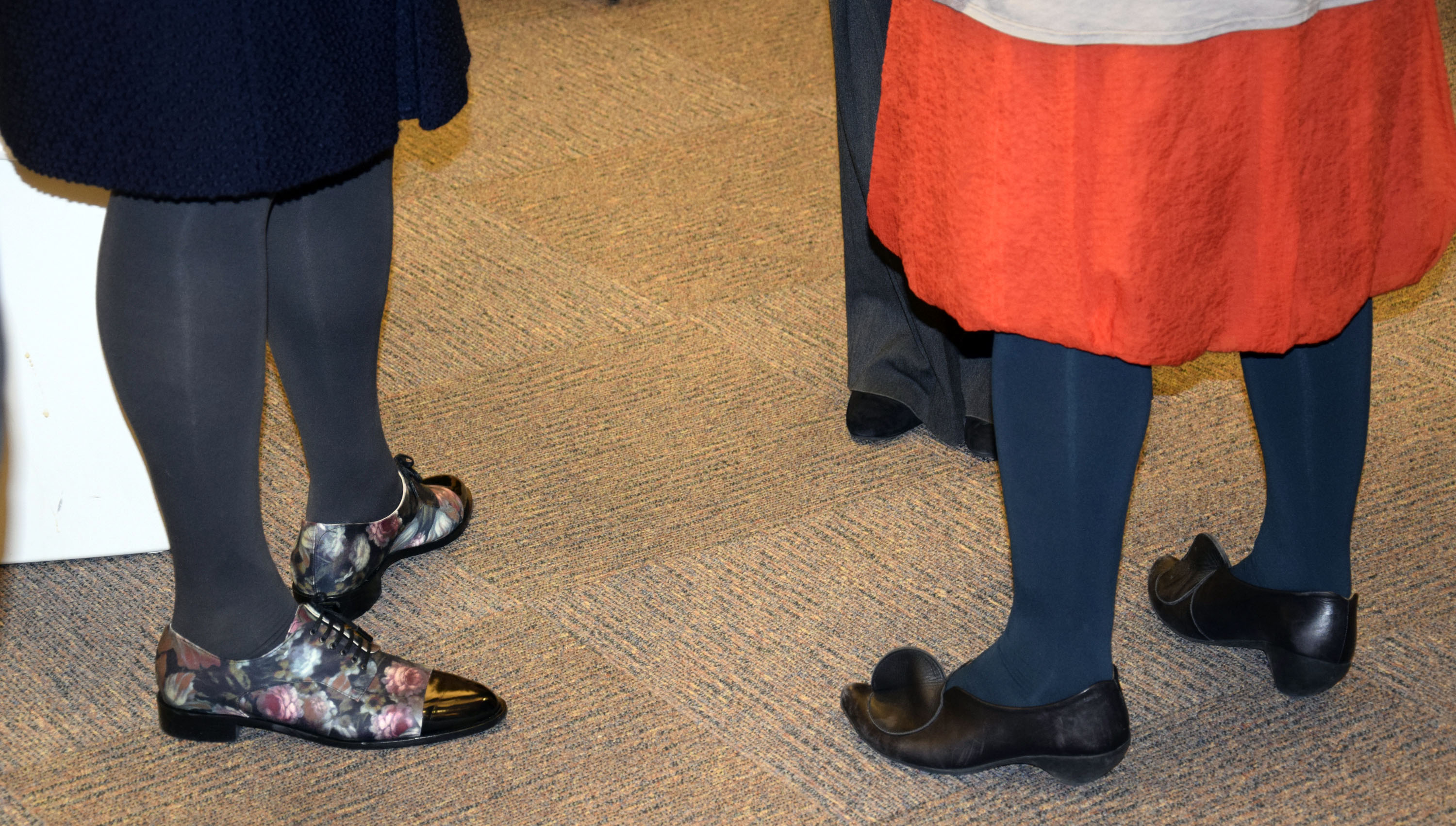
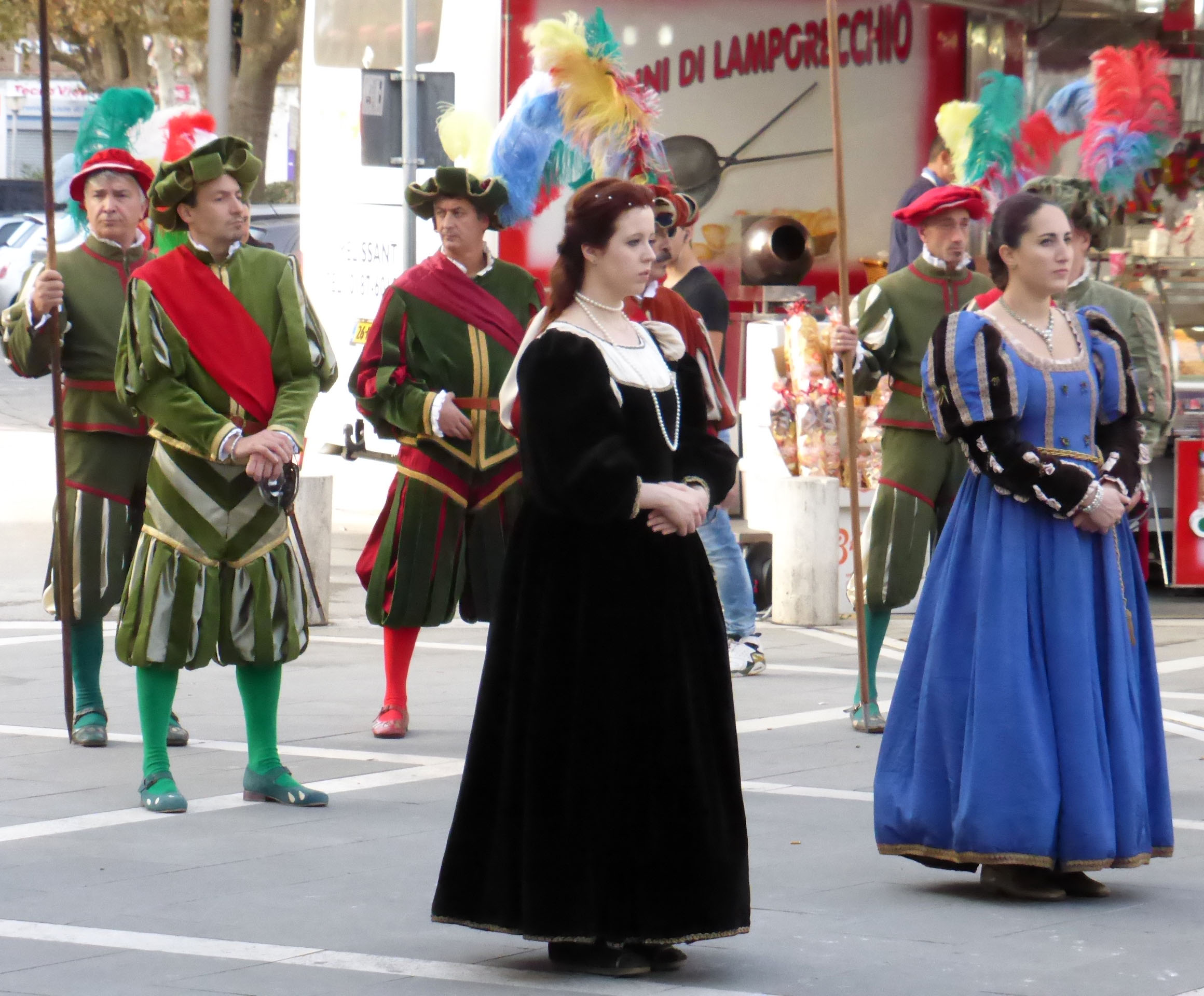
- Abiti colorati e alla moda:


0 comments on “Closing Remarks e galleria fotografica CCIV”Add yours →